They don’t make rates like they used to

They don’t make rates like they used to

Australian mortgage affordability has not changed in over 20 years.

This statement needs a pinch of caveats and a blanket of context, but when all is said and done housing costs have been surprisingly steady.

I didn’t want to write about housing affordability so soon after we checked our privilege, but a Fitzsimmons article in the Sydney Morning Herald piqued my interest. In it, Fitzsimmons focuses on two key affordability ingredients: interest rates and house prices, concluding that “younger Australians definitely have it tougher when it comes to housing affordability”.

There are many ways of measuring housing affordability, but I find Fitzimmons’ measure of choice to be more relevant than most. What proportion of a household’s income is spent on mortgage repayments. According to the article, in the late 80s and early 90s:

“When interest rates were 17 per cent, the proportion of household disposable income that went on the interest payments for the home loan was 6.1 per cent. It’s currently 6.8 per cent.”

These figures metaphorically killed my cat. If interest repayments are below 7%, then why all the commotion?

I believe the article is wrong about the figures, but nailed their consistency.


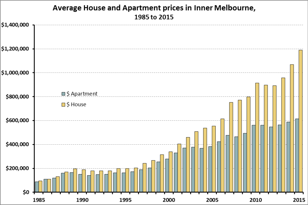
(Data sources for graph in notes below.)

 
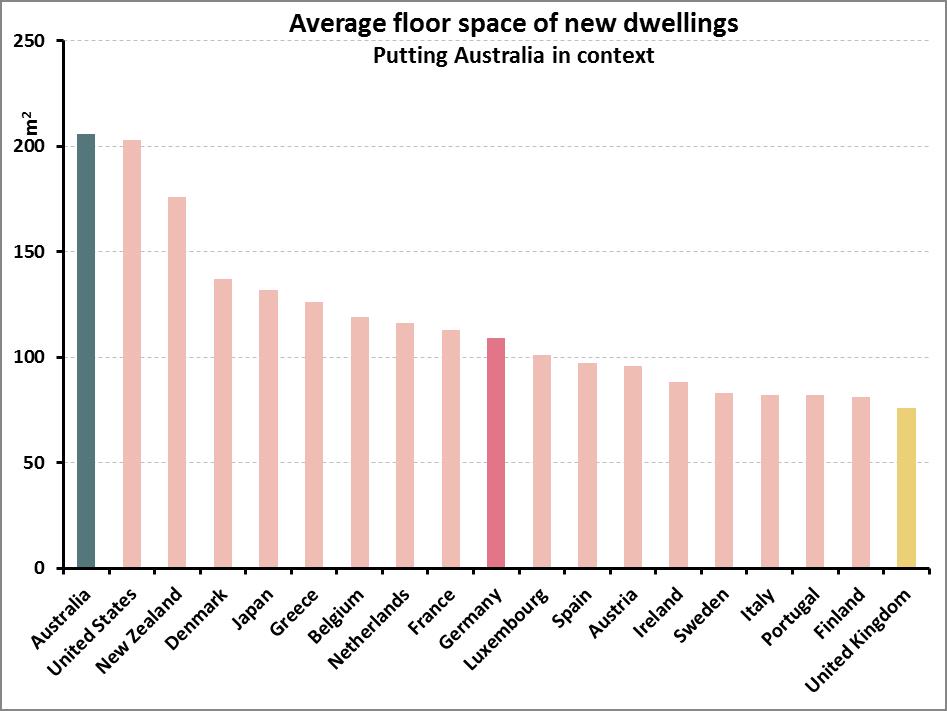
According to data from the Australian Bureau of Statistics, households spent around 24% of their disposable income, on average, on mortgage repayments in 2010. Over half of which went to paying off the interests alone. Mortgage costs as a percentage of gross household income (I’ll use gross instead of disposable from here-on-in as it’s more readily available) have been steady since at least 1993, bouncing between 19% and 23%. Some of this fluctuation may even be ‘margin of error’ as the figures are roughly +/- 2%.  So servicing mortgages now appears at worst as affordable as back in the 90s and 2000s. At best about 4 percentage points lower than in the mid-90s. Repayments were a little smaller in the 80s but the difference is not as big as I expected (15% in 1984 and 18% in 1988-89). Some of this difference is also cushioned by decreasing costs of related items such as furniture and household equipment, which has halved in relative cost compared to 1984 (down from 6% of household income to 3%).

Also, while the outlay in the 80s was smaller, a larger proportion of the repayments were spent covering the interest rather than going towards decreasing the debt.


What about outside of our beautiful borders?

Affordability seems to me more relative than absolute. Australian mortgages may not have changed much in the last decades, but how do we compare to other countries? Lacking an internationally recognised standard for such a measure I was only able to research other rich English speaking countries (my French, Arabic and Chinese aren’t quite up to scratch). And from what I gathered, repayments here are comparable to those in Canada, UK, USA and NZ.


None of this talks about people’s difficulty in breaking into the market, nor how hard it is for low income families to afford a home of their own. But it does suggest that Average Aussie Anne’s situation is not special. Housing has been at similar levels for a while, and it is also at similar levels in other similar countries. So, either the level of affordability is fine, or it’s equally un-affordable elsewhere/else-time.

Also, if the situation is so similar in other countries which have very different taxation systems, with or without such policies like Capital Gains, Negative gearing, and building controls, then ‘solving’ this may not be as easy as some suggest.


Sources

  • The Graph 1 is made from 2 different sources:
  • The Household Expenditure Survey, detailing Interest and Principal Payments separately.
  • The Housing Occupancy and Costs Survey which only provides a total amount. This survey only has “housing costs”, which also includes rates, etc. To account for this, estimates for non-mortgage costs are derived by subtracting the value of “Owner without a mortgage” from “Owner with a mortgage”. It isn’t perfect, but I believe it accurate enough for this purposes.
  • Australian data:
    http://www.abs.gov.au/AUSSTATS/abs@.nsf/DetailsPage/6530.02009-10?OpenDocument (various years)
    http://www.abs.gov.au/ausstats/abs@.nsf/PrimaryMainFeatures/4130.0?OpenDocument
  • USA:
    https://www.census.gov/programs-surveys/ahs/data/interactive/ahstablecreator.html#?s_areas=a00000&s_year=n2011&s_tableName=Table10&s_byGroup1=a7&s_byGroup2=a1&s_filterGroup1=t2&s_filterGroup2=g1https://www.census.gov/programs-surveys/ahs/data/2005/ahs-2005-summary-tables/h150-05.html
  • UK:
    https://www.ons.gov.uk/peoplepopulationandcommunity/personalandhouseholdfinances/incomeandwealth/compendium/familyspending/2015/chapter4trendsinhouseholdexpenditureovertime
    https://www.ons.gov.uk/peoplepopulationandcommunity/personalandhouseholdfinances/incomeandwealth/compendium/familyspending/2015/chapter2housingexpenditure
  • NZ:
    http://www.stats.govt.nz/browse_for_stats/people_and_communities/Households/HouseholdExpenditureStatistics_HOTPYeJun16.aspx
  • Canada:
    http://www5.statcan.gc.ca/cansim/a47
    http://www12.statcan.gc.ca/nhs-enm/2011/as-sa/99-014-x/2011002/tbl/tbl03-eng.cfm

Is it time to check our (housing) privilege?

Is it time to check our (housing) privilege?

1.

The Australian real estate market is off the charts. International comparisons recently published by The Economist confirmed Australia and New Zealand’s housing costs outpaced Europe and North America over the past few decades.

Fortunately for most of us, there are simple solutions which Australia is well placed to take advantage of.


2. Banana republic

When Cyclone Larry hit the Australian shores in 2006 it sent bananas sky high. As the winds decimated the plantations prices increased 600%; from around $2 to $12 a kilo in a matter of weeks. Cyclone Yasi repeated this feat five years later, reaching prices of $15 a kilo.

I love banana smoothies as much as the next guy, so I have rather unpleasant memories of 2006 and 2011. Not a single banana smoothie or pancake in sight, as we all avoided prices akin to today’s smashed avocados.

I, like many of my fellow sufferers, turned to foreign cook books in search of alternatives. I experimented with mango lassis and opened my heart and mouth to strawberry crepes. And while I often dreamt of cavendish fields and lady finger delights, the alternatives had benefits too.

The following years’ harvests were back to normal, and so were the prices. Banana smoothies regained their place upon the thick-drink throne, but I also continued to indulge on the occasional lassi and added crepes to my repertoire.


3. How about them apples

The House-Price Index (HPI) used for comparisons such as The Economist’s includes houses, apartments and other dwelling types. To measure inflation accurately the HPI mirrors the ratio of dwelling types found in the local housing stock. Across the EU roughly 42% of people live in apartments. In Canada and the US the figure is 25% and 21% respectively. Australia, on the other hand, only houses 10% of people in apartments.


One could argue that Europe is structurally different to Australia, with ancient cities and smaller landmasses. But Canada and the US are both quite similar to Australia when it comes to land mass, age and culture. Yet, Australia’s housing stock is half as likely to include smaller units. When you consider that another 6% of Americans (on top of the 21% in units) live in small dwellings such as mobile homes, caravans, etc, Australian’s propensity for houses seems even more like an outlier.

While Ireland and the UK have similar housing ratios to Australia, the majority of them live in “semi-detached” houses, meaning they share at least a wall with their neighbours (terrace and row housing). 90% of Australians, on the other hand, live in fully detached homes; back-yards, front-yards, side-yards. This type of housing has much larger land lots.

Over the past few decades, Australian house prices increased roughly 20% faster than apartment prices. This difference is more pronounced in sought-after areas such as the inner city suburbs where land is at a premium. Due to the compounding effect over a 30 year stretch, this difference in speed means that houses in Stonnington went up 13 times but apartments only increased 7 times.


4. A home among the gumtrees

Such is Australians’ addiction to land (or disdain for apartments) that people choose to live an hour away from the CBD than being stuck in an apartment. In 2015, the average price for a house in Nillumbik Shire was $50k to $70k more than the average apartment in City of Yarra or Melbourne Council ($696k vs $640k and $624k). Nillumbik is roughly 40km from Melbourne’s CBD, and around an hour by train. Similarly, houses in Knox and Maroondah Shires (about 30 kms east of the CBD and 1 hour by public transport) are $80k more on average than the apartments in City of Yarra, and about $50k more than in Port Phillip($682k). Port Phillip is not only just a few kms from town, it’s also on the beach.

The average price of an apartment in the blue LGAs (as depicted in the map below) is cheaper than the average house price in the red LGAs. Houses in the yellow LGAs are cheaper still.
This phenomenon is not limited to big families and households. According to the 2011 Census, only 30% of lone person households in Melbourne lived in apartments, and 17% of 2 person households. Australia wide, only 26% of 1 person households and 14% of 2-person households live in apartments.


5. Compare the pear

Of course these comparisons are a bit strange. Suburban homes have more rooms than inner city apartments. They have yards and land; all good things for some. On the other hand, apartments are close to employment, cultural and retail opportunities, not to mention public and social goods, such as hospitals, public transport, etc, etc. And while the majority of people seem to choose houses, apartments make fine homes too; 42% of Europeans seem to cope.

As the house price index mirrors the local housing stock, the Australian HPI is 90% weighted towards houses. This pretty much hides the lower speed at which apartments increase.

But potentially more importantly, the difference between house prices and apartment prices may be inflated due to houses making better investments. If people bought houses purely for their liveability and not with an eye to their resale value, then perhaps the difference in price would be smaller. Perhaps some of the Australian “housing affordability issue” can be put down to being an “investment affordability issue”.

Some might say that apartments are not the Australian way. Many have fond childhood memories of backyard cricket and jumping over sprinklers to keep cool in summer. However, cities like Melbourne have tripled their population since the 50s, and doubled since the 70s. As the population increases houses need to be built further and further away from city centres in order to stay affordable. This is clearly the current thinking as the Victorian Government recently announced the rezoning of 17 new suburbs to house 100,000 new houses. This would all be fine, except that we’re encouraging people to live roughly 40kms out of town.

Apartments, instead, can already be built cheaply within a 15km radius of the CBD.


6. Mango or papaya?

Comparison is a cruel mistress. Australians feel hard done by when comparing certain aspects of their lives to a place which no longer exists in time and space (1960s Melbourne), but they fail to recognise their relative comfort in comparison to pretty much everyone else in the world today.

Apartment living is not for those who can’t afford a house. It’s for those who have different preferences, like valuing commute time over backyards. And when our tastes and preferences become out of reach, it might be worth opening our minds to other possibilities, consulting foreign cookbooks and considering other fruits.


7. #notallfruits

The term “housing affordability crisis” in this post refers to the current focus on “young Australians’ inability to break into the market“, or that “housing is out of reach of the average Australian“.

It does not discuss the issue of un-affordable rental markets and people struggling to secure a safe roof on an everyday basis.

Rental affordability is a completely different issue and using the same term to discuss both problems is somewhat problematic.

I discuss the rental aspect of housing affordability in these previous posts: Those who can’t afford, rent; and Rental struggles

_____________________________

Sources

  1. All Melbourne house and apartment price info from: http://www.dtpli.vic.gov.au/property-and-land-titles/property-information/property-prices (Statistics (XLS 1.2 MB))
  2. Population distribution by dwelling structure: European countries, America, Canada, NZ, and Australia
  3. Cyclone information – https://www1.ncdc.noaa.gov/pub/data/cmb/bams-sotc/climate-assessment-2006.pdf
  4. Front graphic by LioPutra

Two-speed houses driving inequality across the city

Two-speed houses driving inequality across the city

If you’re looking for a house which appreciates as much as you appreciate it, then you can do worse than the most expensive suburb you can afford. Why? Because it seems that the speed at which a house’s value increase is related to the value of the area it’s in. Expensive area = faster growth. This two-speed real estate market has had a significant impact on inequality across the community.

The property boom has been so prominent that it propelled FOMO to expensive new heights. But this boom has not been felt evenly across Local Government Areas (LGAs). For example, the average house price in Melton City (a relatively cheap area in Melbourne’s west) increased 15% in the 5 years to 2015 (from $354k to $406k). Over the same period, houses in Stonnington City, a very wealthy area, went up by 61% (from $1.5 to $2.4 million).

Stonnington and Melton are obviously hand-picked examples, but the rule generally holds; at least within the Greater Melbourne Metropolitan area.

Dividing Melbourne’s 30 Local Government Areas (LGAs) in quintiles, average house price in the most expensive LGAs (including Bayside, Yarra and Boroondara) increased 7.3% per annum between 2010 and 2015. Mid-priced areas such as Moreland and Banyule increased 4.3% p.a. And the poorest areas of Melbourne (e.g.: Whyndham, Hume, Frankston) only increased 2.5% p.a. To put this in perspective, inflation for the same period was 2.3% p.a.


This correlation between price and growth appears to hold for the past 30 years, (as far back as the dataset goes). However, the last 15 years are slightly more accentuated. If we look at the growth since 1985, richer areas have grown about a third quicker than poorer areas.


It also does not seem to be the result of Hogwarts’ Capital Gains Tax, brought in in 1999, as a very similar pattern existed in 1998 (pre-CGT).


So what does this mean?

Seeing as Australian households hold half their wealth in real estate on average, the difference in speed at which these investments increase has a huge bearing on (in) equality; especially as wealth is a much bigger determinant of inequality than income is.

Unfortunately, there is only one ‘people’ who are in a position to buy houses in the South Yarras, the Tooraks, the Brightons and the East Melbournes of Melbourne – the rich people. Other peoples will not fare half as well.

Back in 1985 the average house in the most expensive LGA was worth 3 times a house in the cheapest LGA. That ratio is now 6.

This is driven by a divergence at both ends. While the cheapest LGAs have slowly decreased from around 63% of Melbourne’s overall average to just over 50%, the most expensive, have shot up from 1.9 times Melbourne’s average to 3 times.


So, while neither of these two houses is producing anything of value, rather just sitting on their nest eggs, by virtue of affording a pricier egg, them rich folk will taste the tastier fruits of no labour. (In fact, an average house in Stonnington makes more money per year than around 90% of taxable individuals in Australia!)

If this pattern continues, the wealth gap will open wider each year. Releasing land for residential growth in the outskirts of the city may not be the answer. This would further distance the less well-off and new home owners from the areas where growth is concentrated. Meanwhile as populations increase a larger market appears in the sought-after areas. This in turn drives up their value, concentrating capital, and further distancing themselves (financially and geographically) from other “peoples”.

If, like the old Australian adage states, Jack’s house is as good as her mistress’s, their land certainly isn’t.


Source:

All house price info from:  http://www.dtpli.vic.gov.au/property-and-land-titles/property-information/property-prices (Statistics (XLS 1.2 MB))

Wealth data from table 8.2 linked

Tax data from Table 16 linked

Feature picture fusion of

https://pixabay.com/en/cottage-house-small-summer-3d-1663741/  &

I, Tennen-Gas (https://commons.wikimedia.org/wiki/File:Mitsubishi_Supershift_001.JPG


Rental struggles

Rental struggles

Australian renters spend 23% more of their budget on rent than mortgagors on loan repayments.

Following from a recent post, this further shows that renting stings more than home-loans, and Australian Governments need to focus more on rental affordability than on those trying to enter the housing markets.  Yet the conversation hardly mentions them.

REnt by quintile

The average Australian renting household spends 22% of their weekly expenditure on rent, while those repaying a home-loan only spend 18% of their weekly bucket.  The analysis, based on the latest (but slightly outdated) ABS figures from 2009-10, shows the difference is more pronounced in the higher income brackets.

The difference is even greater among households whose main source of income is Government pensions and allowances. Aged Pensioners who rent spend 4 times more on rent than mortgagors do on repayments.  Renters relying on unemployment benefits spend 30% of their weekly expenditure on rent, while mortgagors spend half that amount (16%) on repayments.

REnt by pensioners

So, it’s pretty clear that households struggling with housing costs need help to pay their rent, not to continue to amass wealth while chasing the “Australian dream”.

For all the support, subsidies, and attention paid to first home-owners, Australia is in a great place to ensure no one goes without housing. And renters appear to be at the heart of it all.


Sources:

6530.0 Household Expenditure Survey, Australia: Detailed Expenditure Items, 2009-10

65300DO001_200910 Household Expenditure Survey, Australia: Summary of Results, 2009-10

Those who can’t afford, rent.

Those who can’t afford, rent.

With so many budding photographers around Australia, it’s surprising the housing affordability conversation is so out of focus. It seems the pressure is on people paying hundreds a week into someone else’s investment, not on those depositing hundreds of thousands into their own investment bricks. While it may not impact the average Joe, nor Jane next door, rental (un)affordability seems to have a greater impact than the housing bubble on everyone’s lips.

One way to compare the pressures faced by renters and buyers is by analysing their decisions, or those they are forced into. This analysis, like a previous article,  focuses on small families (couples and single parents) with one or two children.  This is mostly to simplify comparisons, looking at a more homogeneous group, rather than drawing conclusions from a wider, more disparate cross-section of the community.

As previously shown, the majority of small families live in homes with a spare bedroom or two. However, a smaller section can’t afford enough bedrooms to go around. For some this means siblings sharing bedrooms, and for a smaller group the parents cohabitate with the kids.

Housing affordability might be affecting buyers and renters, but the figures below show that the pointy end of the rental market pricks more.

Based on 2011 Census data, couples with one child who rent are 8 times more likely to have to share rooms with their child than those who own or are buying their home. For single parents the ratio is 4 to 1. Likewise, families with 2 kids (couples and single parents) who rent are 5 times more likely to make their kids share a room than families who own or are buying.

Insufficient rooms

These families make up a very small proportion of the whole community. But this still affects over 5,400 single-child families living in homes with 1 bedroom or less (studio).

While I personally believe sibling make for great room-mates while growing up, modern Australian culture prefers otherwise, and the decision for kids sharing rooms is shaped somewhat by financial pressures. When parents share a bedroom with their kids, it’s even clearer that financial pressures forced them into an undesired situation.

Whether or not this issue’s media attention is disproportionate overall is a separate question, but perhaps we should pay less attention to those attempting to join the bourgeoisie, and more to the smaller groups facing eviction notices.


Affordability, it’s a matter of expectations

Affordability, it’s a matter of expectations

There is no doubt that Australian property prices are increasing at a rapid rate. Affordability, however, may depend on expectations.

There is a difference between something being unaffordable and it rapidly increasing in price. The topic of housing affordability has been on high rotation in Australian politics for the past few years.  It’s the pinnacle of two topics du jour: Capital Gains Tax and Negative gearing. Much has been written about the impact these two policies have had on house-prices since the 1980s.  However, most articles focus on the speed of the price increase, not on whether houses are relatively ‘affordable’?  What is affordable? Would we think houses affordable if prices dropped by a third?

Much was made of Turnbull’s interview with the one-year-old who negatively geared property (or at least her parents did), and how out of touch the sentiments of the interview were. But it is generally acceptable, on the other hand, for a couple with a 4-month-old to own a home with spare rooms¹.

“We don’t have unreasonable expectations, but those three-bedroom apartments and townhouses are cost prohibitive ….” said Ms Rule-Layton, Coburg.

Census figures show that when it comes to young families with one or two children, spare bedroom(s) are by far the norm, not the exception.

Of the 207,000 couples with one child owning (or paying off) a home in 2011, 91% had at least one spare room. Almost half of these had 2 spare bedrooms or more.

The situation is surprisingly similar for single parents with one kid.  More than 4 out of 5 had at least one spare bedroom, and 27% at least 2.

When it comes to 2 children families, the question of spare bedrooms is slightly more complicated as the issue of sharing bedrooms arises.  Statistics usually show you how many people and rooms there are per home, but not whether kids share rooms making others spare, etc.  However, only 3 in 100 home-owning couples with 2 kids had insufficient rooms for their kids not to have one each.  This figure only rises to 5 in 100 for single parents with 2 kids.

Couples kids rooms

According to the Real Estate Institute of Victoria, 3bdr apartments and houses in inner Melbourne are on average 54% and 32% more expensive than the 2bdr variety.  That roughly equates to an extra $310k for the 3rd bedroom of an apartment, and $285k in a house.

This ratio may not be representative of the whole country but it does suggest that the 3rd bedroom contributes substantially to the price of the dwelling (approximately 30% across the greater Melbourne).

Would homes be deemed affordable today, if the price dropped by this amount?

If families were willing to live without the luxury of a spare bedroom, this saving becomes a real possibility. This relates to the 9 out of 10 couples with one child, and 55 out of 100 couples with 2 children.  Also, to the 42 in 100 families with two kids who have individual rooms.

However, it seems Australians fear room sharing more than they do debt.


The extra bedroom phenomenon is not limited to Australia’s elite. The ratio of houses with at least one spare room is remarkably similar across all socio-economic backgrounds for couples and single-parent families with one child. The difference becomes noticeable on households with 2 or more spare bedrooms.

Couples rooms deciles

Single parentsrooms deciles

And while the spare bedroom, beyond individual kids’ rooms becomes more difficult for the less well-off families, only 9% of the poorest single-parent families don’t have enough rooms for their kids to sleep separately.

Single parentsrooms deciles 2 kids

There is no doubt that Australian property prices are increasing at a rapid rate. Affordability, however, may depend on expectations.

Australia’s housing standards are amongst the highest in the world. The OECD ranks Australia’s housing at 4t4h highest out of the 36 compared in the Better Life Index². Furthermore, within this champagne crowd Australia’s housing costs come a timid 11th cheapest (of the 36) in terms of housing costs vs disposable household income.

Not only are Australian housing standards particularly high, but they are also improving fast. The average floor-space of new homes increased by almost 40% since 1985³, to 208 metres2 in 2013. To put this in context, the average new home in Germany is 109m2 and in the UK it is 76m2.

Average space home

Based on the best international comparisons I could find4, Australia leads the way in size of new dwellings, easily doubling the size of many European countries’.

Apples w watermellons

So, when we hear international house price comparisons, it’s worth remembering we’re not always comparing apples with apples, but rather their apples with our watermelons.

Does Australia have a housing affordability crisis? It’s hard to say. It depends on your definition of affordable. However, there is a lot of room to move if we want to decrease the cost of housing without lowering our standards beyond what is considered acceptable across the rest of the world’s richest countries.

After all, do we even want our in-laws to have a spare room at our place to crash in?  Save yourself the $300k, and shout them a five-star hotel for the few nights a year they do visit the grandkids.


[1] http://www.domain.com.au/news/melbourne-apartment-boom-is-it-working-for-buyers-and-residents-20160429-gogjvs/

[2] http://www.oecdbetterlifeindex.org/topics/housing/

[3] http://www.abs.gov.au/AUSSTATS/abs@.nsf/Previousproducts/8752.0Feature%20Article1Jun%202013

[4] http://www.demographia.com/db-intlhouse.htm