Goats on our roads

Goats on our roads


Seems the latest food fashion in Australian politics is Goat a la scāpé. And it’s being served at both parties.

Politicians are spruiking lowering migration, or at the very least defuse it from the big cities, as it seems foreigners are clogging up our roads. (At least they stopped stealing our sheep!)

The claim seems to follow a simple rationale:
1. Cities (e.g. Melbourne and Sydney) are getting bigger
2. The increase is mostly driven by overseas migration
3. This is putting more people on the roads
4. Hence increased traffic congestion (and insinuations of other social ills)

In short, migrants = traffic congestion. A simple, winning argument.
Except, I’m not convinced it’s true.

Points 1 and 2 are fine. Overseas migration is the largest component of population growth in Australia, particularly our largest cities. Point 3, on the other hand, seems flawed in two ways:

a. The driver: increased congestion could be caused by centralisation of workforce, and
b. Diversity: not all people are equal (in how they travel to work).

While they may appear minor oversights at first, these flaws are so fundamental that migrants may not only be a non-issue, but in fact part of the solution.


Are we jumping to conclusions?

But before we begin, is it worth questioning the conclusion in the first place? How much worse is congestion getting in our big cities? According to the Grattan Institute “the length and time of commutes barely changed in Australia’s biggest cities during the exceptionally rapid population growth between 2011 and 2016. In Sydney, Melbourne, Brisbane and Perth, commute distances in 2016 were almost indistinguishable from 2011″¹.


Let’s focus on Melbourne city to examine this further.

The number of people who work in Melbourne city grew 21% in the period 2011 to 2016, from 347k to 422k². That’s way faster than Melbourne’s overall population increase of 13% in the same period. The increase in CBD jobs may also be driven by the changing make up by industry, i.e. the increase in professional, hospitality, and finance jobs which tend to be more centralised. So, it’s likely there would be more people working in the CBD even without the new migrants.

Yet, even though the number of city workers has increased by 75,000, there’s only 4,000 more people driving into town in 2016 than there were in 2011. That’s because the way in which people travel to work has changed. A smaller percentage drive, and a greater percentage catch public transport, walk/ride or work from home.


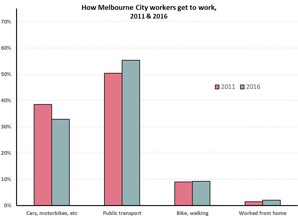
This change seems to be led by recent migrants. City workers who are long term Melbourne residents (i.e. have lived within the Melbourne Metropolitan area for at least 5 years) are 2.5 times more likely to drive to work than recent migrants. While recent migrants are almost 2.5 times more likely to walk or ride to work. Workers who moved to Melbourne from elsewhere in Australia (including country Victoria or interstate), fall somewhere in between.


If the percentage of people driving into town had not changed since 2011, Melbourne would have had an extra 14,000 cars on the road in 2016, not the 4,000 increase which occurred.

This of course is also overly simplifying. Congestion would also have changed the choices of the long-term Melbourne residents if they needed to take on city jobs. But I doubt it would have changed them enough as to resemble the choices of recent migrants. This would include large social changes, an increased acceptance of inner-city apartment living, and waving goodbye to the American Australian home-owning dream.

Similarly, Melbourne could move away from its current thriving tech, financial, educational and hospitality industries which centralise the workforce in town. Specially as without the recent migrants Melbourne would struggle to fill those jobs, as the skills may not be available locally.

But in the current world, the fact that such a large percentage of city workers are recent migrants seems to be the main reasons our roads are not at a stand-still.


Sources:

  1. Terrill, Marion, Batrouney, Hugh, Ha, James, and Hourani,Diana (2018). Remarkably adaptive: Australian cities in a time of growth. Grattan Institute.
  2. All travel to work data sourced form the Australian Bureau of Statistics, Census 2011 and 2016.

Equality: what progressive income taxes giveth, consumption taxes taketh away

Equality: what progressive income taxes giveth, consumption taxes taketh away

There are two broad types of taxes: direct and indirect.

Direct taxes are charged directly by governments, usually on income. This facilitates progressive targeting, taking more from high earners and alleviating the  burden on the poor.

Indirect taxes (e.g. VAT, GST, fuel and tobacco levies) are charged by anyone providing a good or service upon consumption. And the 7Eleven down the street doesn’t know whether you are rich or poor. So a chocolate bar will incur a 20% tax, whether you earn £10,000 or £100,000.


How much does this matter?

The impact of indirect taxes depends on how much you earn. Unfortunately, the less you have the more it impacts.  While income tax progressively increases as your income increases, consumption taxes are regressive. As a result the poorest 10% of UK’s households spend a third of their income on indirect taxes.  The richest 10% on the other hand only spend £1 of every £10 they earn in indirect taxes¹.

Indirect Tax UK 1

The impact of these regressive indirect taxes are such that they cancel out the progressiveness of the income taxes.  That is, once both sets of taxes are considered; households across the UK’s income spectrum contribute the same amount relative to their income. In fact, the poorest 10% of households contribute 10 percentage points more than any other income group.

This trend grew drastically from the late 70s till 2002, and appears to have plateaued since. But it does not appear to be disappearing.

Indirect Tax UK 2


But, what if…

…  the UK got rid of indirect taxes. What if it raised the same revenue as it does today entirely through income taxes, using its current progressive pattern?

Using this ‘what if’ scenario, some measures of inequality would be almost halved:Indirect Tax UK 4

To put the Gini value in perspective, the estimated 0.26 value would put the UK among the most equal countries, alongside Norway, Finland (based on UNDP figures²).


Indirect Tax UK 3

Removing the VAT by itself would make a significant impact, as it accounts for almost half of all indirect taxes.


Reality check

Granted, moving to an entirely direct revenue raising system is neither likely nor simple. But this ridiculous scenario does highlight just how unequal the indirect taxing system is, and what impact it has on equality.

It also suggests that every new or increased indirect tax implemented continues to drive a wedge between the haves and the have-less. This includes the increases in VAT from 15% to 17.5% to 20% over the past 25 years, and any additional levy.

Similarly, if a key aim over the coming years is to decrease inequality, then there may be worse places to start than by lowering VAT, and compensating where necessary with increased income taxes.


Sources:

[1] http://www.ons.gov.uk/peoplepopulationandcommunity/personalandhouseholdfinances/incomeandwealth/datasets/averageincomestaxesandbenefitsbydecilegroupsofallhouseholds

[2]  http://hdr.undp.org/en/content/income-gini-coefficient

UK auto disqualified after poor lifting

UK auto disqualified after poor lifting

In the aftermath of Brexit, the pointy finger of blame has fallen squarely on the rise of conservative patriotism, racism and the stench of economic stagnation among the working poor.

But when analysing the economic situation of UK’s households over the last few decades, it’s hard to see what Brexiters are complaining about.

While American working class wages got stuck in the 1970s, the UK’s have been rising steadily, especially since 1990. In fact since Thatcher lost office, the poorest 40% of households have seen their disposable income increase at twice the rate of the rest of the country.

PoorPoms1

(I use disposable income as it’s a more complete measure of a household’s situation than wages.  It includes all income (private and government cash benefits) and removes direct taxes (income tax).  It’s the money which lands in people’s pockets.)

After adjusting for inflation, household disposable income grew by 71% for the poorest 20% of households, and 59% for the 2nd poorest since 1990.  The rest of the UK only grew by 34%.

The poor are not only getting richer in absolute terms, but also in relative terms.

PoorPoms2

Firstly, absolute growth

The poorest quintile has seen their disposable income increase from £7,200 in 1990 to £12,300 in 2014/15 (after inflation). The second poorest quintile increased from £12,400 to £19,800. No matter how hard life is today for poor households, it would be a lot worse with £6,000 less a year.

To put this growth in perspective, we can compare today’s poor households to that of people in the past.  Today’s 2nd poorest quintile earns the same as the middle quintile earned in 1990. And going back a bit further, they earn the same that the 2nd richest quintile did in 1977, just before Thatcher took office. So, the economic situation of the working class today is similar to that of the upper middle classes when the (Royal variety) Queen celebrated her Silver Jubilee, and Queen (of the Freddy Mercury variety) released “We are the champions”.


Secondly, relative growth

As the poor households’ earnings grew faster than the rich ones, the relative gap has decreases considerably. The disposable income ratio of richest to poorest was 7 at the end of the Iron Lady’s regime. Today that figure is 5.4. Likewise, the ratio between the 2nd richest and 2nd poorest quintiles dropped from 2.4 times to 2.0. Of course, the ratio is still too large, but a 23% drop is worth noting.


Since GFC

The figures above look at the UK since the departure of Lady Thatcher in 1990, but what about a more recent focus?

Well, the picture is even rosier (relatively speaking) for the lowest quintile over the past 7 years.  While the richest 2 quintiles dipped between 5-10% around 2011-12, and have only just returned to pre-crisis levels, the poorest quintile now earns 11% more than they did in 2007/08, and never went behind pre-crisis levels over the period.  The 2nd lowest earners hovered steadily, but over the past 2 years increased to a small increase over pre-crisis levels.

PoorPoms3

A historical lens

A longer search shows that this was not always the case. The last dark age for the lower classes was clearly under Thatcher.  During Margaret’s 11 year regime, the disparity between rich and poor climbed steeply.  While the richest households in the UK experienced a 46% increase in real disposable income, the poorest 2 quintiles only increased by 11 and 13%. This resulted in the income ratio of richest to poorest to rise from 4.9 to 7 in an 11 year period.

PoorPoms4

It’s taken the following 25 years to bring this disparity back to pre-Thatcher levels for 2nd richest to 2nd poorest, but the Richest to poorest ratio is still much higher than it was in the late 70s.

PoorPoms5

Show me the money

Here’s where it gets super interesting. It would be easy to assume that seeing as the end of Thatcherism marked the turning point for income distribution; government handouts would be somewhat responsible for the change. But that is far from the truth. The income growth for the poorest has been largely driven by increases in private income. Since 1990, private income for the poorest has increased by 168%, while Government support only increased 22%! The opposite was surprisingly true under Thatcher, when the bulk of the poor’s income increases came from government benefits.

PoorPoms6

Since 1990, Government support has increased the least for the poorest quintile, in relative AND absolute terms.  While the government now gives the poorest quintile £1,400 more than they did in 1990 (after inflation), they also give middle income earners an extra £3,400, and the richest quintile an extra £1,700 per year, after inflation.

PoorPoms7

Brexit due to a lack of jobs available

Yeah, nah. Unemployment has not been lower than current rates since the mid-70s. Sure there was a momentary blip from the 2008 crisis, but not only did that not reach the unemployment levels seen in the 80s and 90s, it also finished a year ago. People should be high on finding employment at the moment.
PoorPoms8

It’s not you, it’s tax

Even income tax hasn’t been lower in the last 40 years. The poorest households now pay 5 percentage points less in tax than they did 25 years ago, and the middle and upper middle classes have dropped around 3 percentage points. The only section of the community paying more tax (per household) are the richest 20%, and even they only pay less than 1 percentage point more than they used to.

PoorPoms9

So, what the heck are Brexiters complaining about?

Overall the economic situation in the UK has been favourable across the community, and in particular the poorest sections.

  • Income is considerably up
  • Inequality is slightly down
  • Unemployment is at its lowest point in the last 40 years, and
  • Brits have not paid less in taxes in at least 40 years.

Furthermore, the government is increasingly supporting the middle and upper classes through direct cash benefits, so they can hardly complain about the support being handed out to those (arguably) more deserving.

What’s that leave us with

If Brexit was a vote of discontent at the current economic situation, it was a result of perception more than reality. More likely, it was a vote from fear. A xenophobic reaction to the constant hysteria bombarded at the populous, misleading on the current situation. The world is not getting worse. Neither from within, economically, nor from outside evils.

Time for more reasoned responses, from a better informed community.


Sources

All data is sourced from the Office of National Statistics (ONS) UK.

http://www.ons.gov.uk/peoplepopulationandcommunity/personalandhouseholdfinances/incomeandwealth/bulletins/householddisposableincomeandinequality/financialyearending2015

http://www.ons.gov.uk/employmentandlabourmarket/peoplenotinwork/unemployment/timeseries/mgsx/lms

More charity at home, less in Parliament House

More charity at home, less in Parliament House

While Australians are increasing their personal donations, as a country they’ve been giving less and less to foreign aid.

Charity vs ODA

Is this suggesting a misalignment of sentiments between the community and its leadership? Is there a growing desire to support those closest to us, donating to support local causes, while diminishing our desire to help those abroad?

The period graphed included 9.2 different Prime Ministers so it’s hard to pin point the blame the Australian Government’s diminishing willingness to fund foreign aid. And while the coloured timeline suggests that upon winning office Labour increases and Liberal decreases Australia’s Official Development Assistance, the overall picture is clearly trending south. So much so, that Foreign Aid didn’t even rate a mention during the 2016 election campaign.

Australia’s generosity, as individuals and as a country however, leaves much to be desired.  Australians donate around 34 cents for every $100 earned, and the country spends $1.30 in foreign aid for every $100 spent in the federal budget.

But if charity is starting to take off at home, there’s hope it may influence the political agenda.


ODA vs Budget not ODA vs GNI

The graph shows foreign aid expenditure as a percentage of the total federal budget.  Most analysis compares foreign aid to Gross National Income (GNI), with governments stating they’re aiming to reach 0.5%. However, as suggested by Angus Barnes[1] the federal budget, which is within the government’s control, is “a more appropriate denominator”.

Either way the line is almost identical, with the only difference being magnitude – 1% of budget is roughly 0.4% of GNI.


Sources:

[1] http://devpolicy.org/the-odagni-ratio-does-it-truly-reflect-a-governments-commitment-to-aid-20130521/

http://dfat.gov.au/about-us/publications/Documents/statistical-summary-2013-14.pdf

http://www.budget.gov.au/2009-10/content/ministerial_statements/ausaid/html/ms_ausaid-10.htm

They may take away our lives, but they’ll never take our freedom to drive!

They may take away our lives, but they’ll never take our freedom to drive!

Petrol today costs around 40% more than it did 12 years ago, after adjusting for inflation, but Australians still drive like it’s going out of fashion.  Australians have defied the petrol bowser again and again since the 90s, bringing into question what impact some government policies may have in curving our enthusiasm for the wheel. Seems there is no pricing Australians out of their cars.

One of the ways in which governments hope to influence people’s activities and consumption is by affecting prices. All things being equal, increasing costs is meant to decrease consumption.  And decreasing consumption should decrease environmental impact.

Cars petrol links


Yet, Australians are unwilling to let go of their car keys, despite the cost blow out.  Petrol prices increased 51% from 1998 to 2008, and while they’ve dropped slightly from the peak, they are still 35% higher than in the late 90s. Beyond the whinging and media focus on the topic, Australians’ driving habits appear unfazed. Passenger vehicles travel between 7,200km and 7,700km per person every year since the late 90s, with only minor variations each year.

But not only are Australians not driving less, they’re also moving towards less fuel efficient SUVs over sedans.

SUVs cars sales

So, are Australians too wealthy to be easily manipulated by monetary pressures?

An AC Nielsen survey in 2006[1] suggested 60% of Australians were decreasing their car use to deal with the price increases. But it seems people overestimate their willingness or ability to update their behaviours according to their environment.  Increased petrol prices definitely led to increased snarling at the local servo. But people kept find themselves sucking on the bowser’s tit, much like the electorate with the major parties: they don’t like it, but are too lazy to search for other options.

Unless there’s a party willing to go beyond a 50% tax increase to test how elastic the petrol guzzlers are, what chance do governments have to guide behaviour through tariffs.


Sources

http://www.aaa.asn.au/aaa-agenda/affordability/latest-fuel-prices/

http://atrf.info/papers/2010/2010_gargett.pdf

http://stat.abs.gov.au/OECDStat_Metadata/ShowMetadata.ashx?Dataset=ERP_QUARTERLY&ShowOnWeb=true&Lang=en

ABS : 6401.0 Consumer Price Index, Australia, TABLES 1 and 2. CPI: All Groups, Index Numbers and Percentage Changes

[1] http://www.smh.com.au/news/business/aussies-changing-driving-habits-to-cope-with-fuel-prices/2006/03/07/1141493652510.html

Rental struggles

Rental struggles

Australian renters spend 23% more of their budget on rent than mortgagors on loan repayments.

Following from a recent post, this further shows that renting stings more than home-loans, and Australian Governments need to focus more on rental affordability than on those trying to enter the housing markets.  Yet the conversation hardly mentions them.

REnt by quintile

The average Australian renting household spends 22% of their weekly expenditure on rent, while those repaying a home-loan only spend 18% of their weekly bucket.  The analysis, based on the latest (but slightly outdated) ABS figures from 2009-10, shows the difference is more pronounced in the higher income brackets.

The difference is even greater among households whose main source of income is Government pensions and allowances. Aged Pensioners who rent spend 4 times more on rent than mortgagors do on repayments.  Renters relying on unemployment benefits spend 30% of their weekly expenditure on rent, while mortgagors spend half that amount (16%) on repayments.

REnt by pensioners

So, it’s pretty clear that households struggling with housing costs need help to pay their rent, not to continue to amass wealth while chasing the “Australian dream”.

For all the support, subsidies, and attention paid to first home-owners, Australia is in a great place to ensure no one goes without housing. And renters appear to be at the heart of it all.


Sources:

6530.0 Household Expenditure Survey, Australia: Detailed Expenditure Items, 2009-10

65300DO001_200910 Household Expenditure Survey, Australia: Summary of Results, 2009-10

Too many cookies in the education jar

Too many cookies in the education jar

Much is being said of the government’s support of private over public education of late. Last week was accentuated by the Private school, public cost report suggesting private funding will soon overtake public, with other opinion pieces echoing its sentiments.

According to the research based on MySchool data, Government support for private school is growing at twice the rate of public schools’ support.  This, however, is only true if you focus on the last 6 years.  The complete opposite trend was true for the 5 years prior. While MySchool data is only available since 2009, the Productivity Commission’s Report on Government Services goes further back and shows a different trend over an extended timeline¹.

Growth in backing 2 by 5 yearsThe report’s major strength is that it compares a finer slice of the community, focusing on schools with similar socio-economic backgrounds. This removes the effect of funding allocations based on need, which the government currently follows. Seeing as public schools disproportionately service poorer areas, using PC’s rough average (as I did) overestimates the difference in funding as the population serviced by private schools is generally cheaper to support. Unfortunately, the complete MySchool data is not easily available online, so my analysis is restricted to aggregate data and misses this finer level investigation.

However, while I suspect the difference is smaller than that suggested by the PC analysis above, the trend over the 11 years is likely to be the same.

Surprisingly, it’s not only Federal Governments whose support increased faster for private schools over the past 6 years.  State Governments increased private schools funding at 2.6 times the public schools’ rate between 2009 and 2014, with all but NSW and SA increasing support for private faster than for public over that period.  Northern Territory’s private school support grew at almost twice the rate of their public school support.

Growth in backing by sector

Growth in Federal Government’s support has been relatively even over the same period, with private schools funding growing 18% faster than public.

Growth in backing

(N.B.: All analysis is conducted on figures adjusted for inflation.)

The main reason for private schools outpacing public schools is that Federal Govs have increased school funding faster than State Govs.  Over the 6 years in question, State Government funding on average increased by a miserly 4%, while Federal Governments increased education support by 25%.  As Federal support private education more than they do public (as a base rule), their increase ends up largely in private coffers.  Even if Federal grants increased equally across both sectors of education, private schools would win.

This does not excuse the recent growing support for private school funding, but suggests that perhaps our current funding models are too complex and compartmentalised to understand how each lever impacts individuals and/or the entire system. We have too many jars, and too many types of cookies in them. Whether on purpose or misfortune, this often leads to undesired results, like the examples mentioned in the Private school, public cost report, where some private schools receive more funding than their neighbouring public educators.

As long as private schooling is legal, governments need to ensure they are adequately funded and this means continue funding for private education. However, the upper echelons of private education should not be taking resources away from those who need it most.

Education policies should be about more than funding, i.e. how the funding will be used, but perhaps there is room for one overarching policy, not about how much funding will be allocated, but how the cookie factory will be better and more equitably managed


[1] Following “Private school, public cost” methodology, public funding is multiplied by 0.85 to remove User Cost of Capital.

It’s not the size of your budget, but how you use it that counts.

It’s not the size of your budget, but how you use it that counts.

Education policy discussions focus almost exclusively on funding, and this election carries the stench of a pissing competition. However, based on OECD PISA findings there is no link between spending and outcomes, and more so, increased funding over the past 10 years has not shown improvements in student achievements¹.

Even if this weren’t the case, Australia is already among the top spenders in the world, with continuous funding growth going back decades.

School funding appears to only improve achievement up to the point where US $50,000 (ppp) is spent per student over the course of their schooling. Beyond this amount, spending does not seem to improve outcomes. Australia already spends double this amount, and is only surpassed by six countries. Of these six, only Switzerland performed better in PISA 2012.

(The following graphs are sourced from the OECD’s PISA:  
What Makes Schools Successful? Resources, Policies and Practices – Volume IV Publication)

PISA Spending

Much like Australia, most OECD countries increased expenditure in education in the period 2003 to 2012, yet the majority did not find improvements in student outcomes, with many (including Australia) going backwards.

PISA Spending increased

So perhaps it’s time we elevate the conversation from “my education budget is bigger than yours” to “this is how we’ll improve education outcomes, and here is all the research which makes us confident it’s the best way to invest the public purse”.

The current discourse gives the impression that education is under constant attack. However, school funding is ever increasing.  Public schools receive around 15% more per student now than they did 10 years ago (adjusted for inflation). Taking a historical view, public schools are now funded at twice the rate they were in the mid-90s and four times the rate of the mid-70s².

This is not to say that funding doesn’t need fixing, but I doubt it’s a case of needing more, rather better investment and distribution; for decisions to be made based on evidence, not political persuasion.

“What do we want?”

“Evidence based policies!!!”

“When do want them?”

“When they are good and ready, and the research is robust.”


[1] https://www.oecd.org/pisa/keyfindings/pisa-2012-results-volume-IV.pdf

[2] http://www.abs.gov.au/Ausstats/abs@.nsf/0/A75909A2108CECAACA2569DE002539FB?Open & http://www.pc.gov.au/research/ongoing/report-on-government-services/2016/childcare-education-and-training/school-education & http://www.abs.gov.au/ausstats/abs@.nsf/mf/6401.0

Those who can’t afford, rent.

Those who can’t afford, rent.

With so many budding photographers around Australia, it’s surprising the housing affordability conversation is so out of focus. It seems the pressure is on people paying hundreds a week into someone else’s investment, not on those depositing hundreds of thousands into their own investment bricks. While it may not impact the average Joe, nor Jane next door, rental (un)affordability seems to have a greater impact than the housing bubble on everyone’s lips.

One way to compare the pressures faced by renters and buyers is by analysing their decisions, or those they are forced into. This analysis, like a previous article,  focuses on small families (couples and single parents) with one or two children.  This is mostly to simplify comparisons, looking at a more homogeneous group, rather than drawing conclusions from a wider, more disparate cross-section of the community.

As previously shown, the majority of small families live in homes with a spare bedroom or two. However, a smaller section can’t afford enough bedrooms to go around. For some this means siblings sharing bedrooms, and for a smaller group the parents cohabitate with the kids.

Housing affordability might be affecting buyers and renters, but the figures below show that the pointy end of the rental market pricks more.

Based on 2011 Census data, couples with one child who rent are 8 times more likely to have to share rooms with their child than those who own or are buying their home. For single parents the ratio is 4 to 1. Likewise, families with 2 kids (couples and single parents) who rent are 5 times more likely to make their kids share a room than families who own or are buying.

Insufficient rooms

These families make up a very small proportion of the whole community. But this still affects over 5,400 single-child families living in homes with 1 bedroom or less (studio).

While I personally believe sibling make for great room-mates while growing up, modern Australian culture prefers otherwise, and the decision for kids sharing rooms is shaped somewhat by financial pressures. When parents share a bedroom with their kids, it’s even clearer that financial pressures forced them into an undesired situation.

Whether or not this issue’s media attention is disproportionate overall is a separate question, but perhaps we should pay less attention to those attempting to join the bourgeoisie, and more to the smaller groups facing eviction notices.


Affordability, it’s a matter of expectations

Affordability, it’s a matter of expectations

There is no doubt that Australian property prices are increasing at a rapid rate. Affordability, however, may depend on expectations.

There is a difference between something being unaffordable and it rapidly increasing in price. The topic of housing affordability has been on high rotation in Australian politics for the past few years.  It’s the pinnacle of two topics du jour: Capital Gains Tax and Negative gearing. Much has been written about the impact these two policies have had on house-prices since the 1980s.  However, most articles focus on the speed of the price increase, not on whether houses are relatively ‘affordable’?  What is affordable? Would we think houses affordable if prices dropped by a third?

Much was made of Turnbull’s interview with the one-year-old who negatively geared property (or at least her parents did), and how out of touch the sentiments of the interview were. But it is generally acceptable, on the other hand, for a couple with a 4-month-old to own a home with spare rooms¹.

“We don’t have unreasonable expectations, but those three-bedroom apartments and townhouses are cost prohibitive ….” said Ms Rule-Layton, Coburg.

Census figures show that when it comes to young families with one or two children, spare bedroom(s) are by far the norm, not the exception.

Of the 207,000 couples with one child owning (or paying off) a home in 2011, 91% had at least one spare room. Almost half of these had 2 spare bedrooms or more.

The situation is surprisingly similar for single parents with one kid.  More than 4 out of 5 had at least one spare bedroom, and 27% at least 2.

When it comes to 2 children families, the question of spare bedrooms is slightly more complicated as the issue of sharing bedrooms arises.  Statistics usually show you how many people and rooms there are per home, but not whether kids share rooms making others spare, etc.  However, only 3 in 100 home-owning couples with 2 kids had insufficient rooms for their kids not to have one each.  This figure only rises to 5 in 100 for single parents with 2 kids.

Couples kids rooms

According to the Real Estate Institute of Victoria, 3bdr apartments and houses in inner Melbourne are on average 54% and 32% more expensive than the 2bdr variety.  That roughly equates to an extra $310k for the 3rd bedroom of an apartment, and $285k in a house.

This ratio may not be representative of the whole country but it does suggest that the 3rd bedroom contributes substantially to the price of the dwelling (approximately 30% across the greater Melbourne).

Would homes be deemed affordable today, if the price dropped by this amount?

If families were willing to live without the luxury of a spare bedroom, this saving becomes a real possibility. This relates to the 9 out of 10 couples with one child, and 55 out of 100 couples with 2 children.  Also, to the 42 in 100 families with two kids who have individual rooms.

However, it seems Australians fear room sharing more than they do debt.


The extra bedroom phenomenon is not limited to Australia’s elite. The ratio of houses with at least one spare room is remarkably similar across all socio-economic backgrounds for couples and single-parent families with one child. The difference becomes noticeable on households with 2 or more spare bedrooms.

Couples rooms deciles

Single parentsrooms deciles

And while the spare bedroom, beyond individual kids’ rooms becomes more difficult for the less well-off families, only 9% of the poorest single-parent families don’t have enough rooms for their kids to sleep separately.

Single parentsrooms deciles 2 kids

There is no doubt that Australian property prices are increasing at a rapid rate. Affordability, however, may depend on expectations.

Australia’s housing standards are amongst the highest in the world. The OECD ranks Australia’s housing at 4t4h highest out of the 36 compared in the Better Life Index². Furthermore, within this champagne crowd Australia’s housing costs come a timid 11th cheapest (of the 36) in terms of housing costs vs disposable household income.

Not only are Australian housing standards particularly high, but they are also improving fast. The average floor-space of new homes increased by almost 40% since 1985³, to 208 metres2 in 2013. To put this in context, the average new home in Germany is 109m2 and in the UK it is 76m2.

Average space home

Based on the best international comparisons I could find4, Australia leads the way in size of new dwellings, easily doubling the size of many European countries’.

Apples w watermellons

So, when we hear international house price comparisons, it’s worth remembering we’re not always comparing apples with apples, but rather their apples with our watermelons.

Does Australia have a housing affordability crisis? It’s hard to say. It depends on your definition of affordable. However, there is a lot of room to move if we want to decrease the cost of housing without lowering our standards beyond what is considered acceptable across the rest of the world’s richest countries.

After all, do we even want our in-laws to have a spare room at our place to crash in?  Save yourself the $300k, and shout them a five-star hotel for the few nights a year they do visit the grandkids.


[1] http://www.domain.com.au/news/melbourne-apartment-boom-is-it-working-for-buyers-and-residents-20160429-gogjvs/

[2] http://www.oecdbetterlifeindex.org/topics/housing/

[3] http://www.abs.gov.au/AUSSTATS/abs@.nsf/Previousproducts/8752.0Feature%20Article1Jun%202013

[4] http://www.demographia.com/db-intlhouse.htm

How Aus $ affects Aus votes

How Aus $ affects Aus votes

There is no correlation between an electorate’s socio-economic standing and its preferred political party, at least not in the 2013 elections.

The simplistic view of politics suggests one party proposes policies which help poor people and the other party angles to improve the lives of those more fortunate. Yet, in Australia, the socio-economic make-up of an electorate is a very poor predictor of which party will be voted in, at least not nation-wide. It seems Labor electorates are not the working class suburbs usually portrayed, and Liberal electorates aren’t the prime real estate so often generalised.

This is clearly seen when focusing on the top 10 Liberal/National coalition seats.

Top 10 Liberal Seats

As the graph above shows, the ‘rich’ are grossly under-represented in the top 3 ‘liberal/national’ seats, and in three more of the safest Liberal seats.  On the other hand, they are hugely overrepresented in the other 4 of the top 10 seats (averaging 85% of each overrepresented electorate).  As an example, Mallee, on the NSW/Victorian border, has the highest Liberal vote, yet over 50% of the population falls in the bottom 30%, and only 6% are considered in the top 30% of Australia.

The graph below examines the link across all the electorates, by mapping the Labor 2-party preferred vote to the percentage of the electorate which falls in the bottom 30% of the socio-economic spectrum. (It’s a mess!)

Link Labour SEIFA

Similarly, there appears to be no relationship between party allegiance and private schooling.  For all the apparent willingness of the Liberal party to support private schools, areas with a high percentage of kids attending private school are just as likely to vote blue as they are red.

Liberal Private schools

While it seems there is no link between ‘class’ and politics Australia wide, a relationship does exist within capital cities.  Filtering out electorates which have less than two-thirds of its population within a capital city (using ABS’s remoteness divisions), a correlation of 0.51 appears between the Labor vote and areas with high proportions of low socio-economic households.  This means that the larger the percentage of ‘lower class’ households in an electorate, the more likely Labor is to win the seat.  Similarly, the more rich households there are in a city electorate, the more likely the Liberal Party is to win.

(Graph slightly less messy.)

Link in Cities

No such link appears to occur outside of the major cities, neither in regional cities nor in rural areas.

So, are parties not catering to one side over the other, or are constituents unable to discern how each party’s policies will affect them, or do people not vote based on what may benefit them? Or is politics a whole lot more complicated than that?


______________________________


Sources

Voting from Australian Electorate Commission http://results.aec.gov.au/17496/Website/HouseDownloadsMenu-17496-csv.htm

Socio-economic and School attendance from ABS, Census Statistics.

http://www.abs.gov.au/websitedbs/censushome.nsf/home/Census?opendocument&ref=topBar