They may take away our lives, but they’ll never take our freedom to drive!

They may take away our lives, but they’ll never take our freedom to drive!

Petrol today costs around 40% more than it did 12 years ago, after adjusting for inflation, but Australians still drive like it’s going out of fashion.  Australians have defied the petrol bowser again and again since the 90s, bringing into question what impact some government policies may have in curving our enthusiasm for the wheel. Seems there is no pricing Australians out of their cars.

One of the ways in which governments hope to influence people’s activities and consumption is by affecting prices. All things being equal, increasing costs is meant to decrease consumption.  And decreasing consumption should decrease environmental impact.

Cars petrol links


Yet, Australians are unwilling to let go of their car keys, despite the cost blow out.  Petrol prices increased 51% from 1998 to 2008, and while they’ve dropped slightly from the peak, they are still 35% higher than in the late 90s. Beyond the whinging and media focus on the topic, Australians’ driving habits appear unfazed. Passenger vehicles travel between 7,200km and 7,700km per person every year since the late 90s, with only minor variations each year.

But not only are Australians not driving less, they’re also moving towards less fuel efficient SUVs over sedans.

SUVs cars sales

So, are Australians too wealthy to be easily manipulated by monetary pressures?

An AC Nielsen survey in 2006[1] suggested 60% of Australians were decreasing their car use to deal with the price increases. But it seems people overestimate their willingness or ability to update their behaviours according to their environment.  Increased petrol prices definitely led to increased snarling at the local servo. But people kept find themselves sucking on the bowser’s tit, much like the electorate with the major parties: they don’t like it, but are too lazy to search for other options.

Unless there’s a party willing to go beyond a 50% tax increase to test how elastic the petrol guzzlers are, what chance do governments have to guide behaviour through tariffs.


Sources

http://www.aaa.asn.au/aaa-agenda/affordability/latest-fuel-prices/

Click to access 2010_gargett.pdf

http://stat.abs.gov.au/OECDStat_Metadata/ShowMetadata.ashx?Dataset=ERP_QUARTERLY&ShowOnWeb=true&Lang=en

ABS : 6401.0 Consumer Price Index, Australia, TABLES 1 and 2. CPI: All Groups, Index Numbers and Percentage Changes

[1] http://www.smh.com.au/news/business/aussies-changing-driving-habits-to-cope-with-fuel-prices/2006/03/07/1141493652510.html

Affordability, it’s a matter of expectations

Affordability, it’s a matter of expectations

There is no doubt that Australian property prices are increasing at a rapid rate. Affordability, however, may depend on expectations.

There is a difference between something being unaffordable and it rapidly increasing in price. The topic of housing affordability has been on high rotation in Australian politics for the past few years.  It’s the pinnacle of two topics du jour: Capital Gains Tax and Negative gearing. Much has been written about the impact these two policies have had on house-prices since the 1980s.  However, most articles focus on the speed of the price increase, not on whether houses are relatively ‘affordable’?  What is affordable? Would we think houses affordable if prices dropped by a third?

Much was made of Turnbull’s interview with the one-year-old who negatively geared property (or at least her parents did), and how out of touch the sentiments of the interview were. But it is generally acceptable, on the other hand, for a couple with a 4-month-old to own a home with spare rooms¹.

“We don’t have unreasonable expectations, but those three-bedroom apartments and townhouses are cost prohibitive ….” said Ms Rule-Layton, Coburg.

Census figures show that when it comes to young families with one or two children, spare bedroom(s) are by far the norm, not the exception.

Of the 207,000 couples with one child owning (or paying off) a home in 2011, 91% had at least one spare room. Almost half of these had 2 spare bedrooms or more.

The situation is surprisingly similar for single parents with one kid.  More than 4 out of 5 had at least one spare bedroom, and 27% at least 2.

When it comes to 2 children families, the question of spare bedrooms is slightly more complicated as the issue of sharing bedrooms arises.  Statistics usually show you how many people and rooms there are per home, but not whether kids share rooms making others spare, etc.  However, only 3 in 100 home-owning couples with 2 kids had insufficient rooms for their kids not to have one each.  This figure only rises to 5 in 100 for single parents with 2 kids.

Couples kids rooms

According to the Real Estate Institute of Victoria, 3bdr apartments and houses in inner Melbourne are on average 54% and 32% more expensive than the 2bdr variety.  That roughly equates to an extra $310k for the 3rd bedroom of an apartment, and $285k in a house.

This ratio may not be representative of the whole country but it does suggest that the 3rd bedroom contributes substantially to the price of the dwelling (approximately 30% across the greater Melbourne).

Would homes be deemed affordable today, if the price dropped by this amount?

If families were willing to live without the luxury of a spare bedroom, this saving becomes a real possibility. This relates to the 9 out of 10 couples with one child, and 55 out of 100 couples with 2 children.  Also, to the 42 in 100 families with two kids who have individual rooms.

However, it seems Australians fear room sharing more than they do debt.


The extra bedroom phenomenon is not limited to Australia’s elite. The ratio of houses with at least one spare room is remarkably similar across all socio-economic backgrounds for couples and single-parent families with one child. The difference becomes noticeable on households with 2 or more spare bedrooms.

Couples rooms deciles

Single parentsrooms deciles

And while the spare bedroom, beyond individual kids’ rooms becomes more difficult for the less well-off families, only 9% of the poorest single-parent families don’t have enough rooms for their kids to sleep separately.

Single parentsrooms deciles 2 kids

There is no doubt that Australian property prices are increasing at a rapid rate. Affordability, however, may depend on expectations.

Australia’s housing standards are amongst the highest in the world. The OECD ranks Australia’s housing at 4t4h highest out of the 36 compared in the Better Life Index². Furthermore, within this champagne crowd Australia’s housing costs come a timid 11th cheapest (of the 36) in terms of housing costs vs disposable household income.

Not only are Australian housing standards particularly high, but they are also improving fast. The average floor-space of new homes increased by almost 40% since 1985³, to 208 metres2 in 2013. To put this in context, the average new home in Germany is 109m2 and in the UK it is 76m2.

Average space home

Based on the best international comparisons I could find4, Australia leads the way in size of new dwellings, easily doubling the size of many European countries’.

Apples w watermellons

So, when we hear international house price comparisons, it’s worth remembering we’re not always comparing apples with apples, but rather their apples with our watermelons.

Does Australia have a housing affordability crisis? It’s hard to say. It depends on your definition of affordable. However, there is a lot of room to move if we want to decrease the cost of housing without lowering our standards beyond what is considered acceptable across the rest of the world’s richest countries.

After all, do we even want our in-laws to have a spare room at our place to crash in?  Save yourself the $300k, and shout them a five-star hotel for the few nights a year they do visit the grandkids.


[1] http://www.domain.com.au/news/melbourne-apartment-boom-is-it-working-for-buyers-and-residents-20160429-gogjvs/

[2] http://www.oecdbetterlifeindex.org/topics/housing/

[3] http://www.abs.gov.au/AUSSTATS/abs@.nsf/Previousproducts/8752.0Feature%20Article1Jun%202013

[4] http://www.demographia.com/db-intlhouse.htm

How Aus $ affects Aus votes

How Aus $ affects Aus votes

There is no correlation between an electorate’s socio-economic standing and its preferred political party, at least not in the 2013 elections.

The simplistic view of politics suggests one party proposes policies which help poor people and the other party angles to improve the lives of those more fortunate. Yet, in Australia, the socio-economic make-up of an electorate is a very poor predictor of which party will be voted in, at least not nation-wide. It seems Labor electorates are not the working class suburbs usually portrayed, and Liberal electorates aren’t the prime real estate so often generalised.

This is clearly seen when focusing on the top 10 Liberal/National coalition seats.

Top 10 Liberal Seats

As the graph above shows, the ‘rich’ are grossly under-represented in the top 3 ‘liberal/national’ seats, and in three more of the safest Liberal seats.  On the other hand, they are hugely overrepresented in the other 4 of the top 10 seats (averaging 85% of each overrepresented electorate).  As an example, Mallee, on the NSW/Victorian border, has the highest Liberal vote, yet over 50% of the population falls in the bottom 30%, and only 6% are considered in the top 30% of Australia.

The graph below examines the link across all the electorates, by mapping the Labor 2-party preferred vote to the percentage of the electorate which falls in the bottom 30% of the socio-economic spectrum. (It’s a mess!)

Link Labour SEIFA

Similarly, there appears to be no relationship between party allegiance and private schooling.  For all the apparent willingness of the Liberal party to support private schools, areas with a high percentage of kids attending private school are just as likely to vote blue as they are red.

Liberal Private schools

While it seems there is no link between ‘class’ and politics Australia wide, a relationship does exist within capital cities.  Filtering out electorates which have less than two-thirds of its population within a capital city (using ABS’s remoteness divisions), a correlation of 0.51 appears between the Labor vote and areas with high proportions of low socio-economic households.  This means that the larger the percentage of ‘lower class’ households in an electorate, the more likely Labor is to win the seat.  Similarly, the more rich households there are in a city electorate, the more likely the Liberal Party is to win.

(Graph slightly less messy.)

Link in Cities

No such link appears to occur outside of the major cities, neither in regional cities nor in rural areas.

So, are parties not catering to one side over the other, or are constituents unable to discern how each party’s policies will affect them, or do people not vote based on what may benefit them? Or is politics a whole lot more complicated than that?


______________________________


Sources

Voting from Australian Electorate Commission http://results.aec.gov.au/17496/Website/HouseDownloadsMenu-17496-csv.htm

Socio-economic and School attendance from ABS, Census Statistics.

http://www.abs.gov.au/websitedbs/censushome.nsf/home/Census?opendocument&ref=topBar

Smoking the poor

Smoking the poor

Australia’s 2016-17 budget announcement included “four annual 12.5 per cent increases in tobacco excise and excise equivalent customs duties”, claiming it will raise “$4.7bn over the next four years”.¹

This is unlikely to face much opposition. After all, taxing smoking aims to discourage the leading cause of preventable deaths in Australia².

But it’s interesting to see who will be most impacted by this, as smoking is a poor person’s game.

Based on 2009-10 household expenditure data³, increasing the cost of smoking will have a much larger impact on the poorest sectors of the community than anyone else.  More specifically, it will impact households receiving unemployment, disability, and carers payments – those already under the most amount of financial strain.

Smoking poor

Back in 2010, the poorest 20% of households were already spending four times as much of their weekly expenditure as the richest 20%.  Households whose main source of income was unemployment benefits spent three and half times the national average on tobacco, in relation to their total income.  Those whose main income was disability and carer payments spent three times the national average.

This is likely to be much more accentuated today as the 25% annual increase in tobacco excise since 2010 has almost doubled the price of cigarettes since that data was produced[4].

So how will this picture look in 4 years’ time, after 8 years of tobacco increases, when a packet of winnie blues cost $50?

Smoking is addictive. I suspect it’s easier to sell a house than quit smoking. Yet, when governments change legislation, making previous decisions less financially desirable, there’s usually talk of ‘grandfathering’ policies. That is to say that if we ever change capital gains policies we’ll ensure those who got in on the action prior to the changes don’t lose out.  Should similar considerations be made with smokers? Or is this more like the drug dealer who gives away the first few hits until you’re hooked, and then jacks up the prices, marginalising the destitute to a life of crime, imprisonment and social isolation?

I suspect it’s not all bad. Many will quit, thus improving their lives, and those of their loved ones. But for those unable to let go of nicotine’s vice, I suspect health issues will be only part of their worries.


[1] http://www.budget.gov.au/2016-17/content/glossies/tax_super/html/tax_super-05.htm#health

[2] http://www.quit.org.au/resource-centre/facts-evidence/the-big-kill

[3] http://www.abs.gov.au/AUSSTATS/abs@.nsf/Lookup/6530.0Main+Features12009-10?OpenDocument

[4] http://www.tobaccoinaustralia.org.au/13-3-the-price-of-tobacco-products-in-australia

If Australia were 100 stereotypes

If Australia were 100 stereotypes

For as long as I can remember it’s felt like we’ve been breaking down barriers and tearing down the regimes of acceptability. Traditional roles are no longer the norm, travelled by choice not momentum. Everybody’s road-fork a choice to be made.
But despite the changes, work occupations are still bastions of gender segregation.

Clichés and stereotypes such as tradies are men and teachers are women may not help fight outdated and ingrained social expectations, but they’re still the case in Australia, according to the latest ATO figures for 2013-14. Based on self-identified information from tax returns, there are 52,305 carpenters in Australia, of which only 127 are women. Similarly, only 94 of the 34,362 plumbers are women. That’s 0.2% and 0.3% of each occupation.

To simplify the situation using a popular meme: if Australia were 100 carpenters (or plumbers), none of them would be women. Not one.

IfAuswere 100 Carpenters

(I’ve not stats on how many are called Warren)

While I expected clichés to imitate life, I assumed they were exaggerating.

Overall, 637,402 Australians work in occupations where men make up at least 99% of the workforce. That’s 6% of all people with a known occupation. More broadly speaking, 35% of tax-paying men have roles where men make up at least 90% of the occupation. 50% occupy roles where men dominate by at least 80%. That’s to say that half of all working men live in roles where they outnumber women by (at least) 4 to 1. This includes occupations such as:

Top men occupations

What kind of impact is this environment and constant reinforcement having on half of all men?

While women dominated roles are less pronounced, 40% of women work in roles where women make up (at least) 80% of the workforce. This includes the following occupations:

Top women occupations

This lopsidedness on both sides means a minority of all workers (17%) fill roles which are equally distributed. (Evenly distributed is defined as 50 +/- 10%.)

Distribution of sex occupations

If we are to break down the gap between sexes, either roles need to become a lot less “gendered” or occupations need to become a lot more evenly rewarded. Whilst some movements has been made towards more equal distributions in the past 30 years, the information above shows there’s a huge way still to go.


All figures based on ATO statistics for 2013-14, Individuals Table 14A&14B.

https://www.ato.gov.au/About-ATO/Research-and-statistics/In-detail/Tax-statistics/Taxation-statistics-2013-14/


De-constructing the ‘g’ gap

De-constructing the ‘g’ gap

Last week was International Women’s Day so everyone should be up to date with the latest estimate of the gender pay gap (17%), and very well versed on at least three theories behind it.

Now, then, might be the perfect time to ask why the social progress and workforce changes which occurred over the last 30 years have had no impact on the gap.

The increasing awareness, numerous policies, university attendance explosion, increasing maternity leave and participation rates, industrial and occupational distributions, and a myriad other variables have increased or decreased to varying degrees. Mostly towards gender parity. Yet the pay gap for full-time women has not deviated more than +/- 2 percentage points since Lionel Ritchie first sang “Hello…. is it me you’re looking for?!”[1].

Gender Pay gap 83 15

The gap itself is a complex issue with many moving parts. This is a look at a few of those parts, and a general wondering: how is it not improving?


An aging workforce

One of the biggest changes in the workforce has been workers’ age. Average full-time wages increase rapidly with age, until they begin plateauing around 30, finally peaking in the late 30s to mid 40s (depending on occupation and role).  On average, workers under 25 earn 40% less than those 25 years and over[2].

Historically, one of the reasons behind the wage gap has been that working women are dis-proportionally younger than men, and therefore lower paid (i.e. junior staff on junior wages).  But the age demographic across the sexes has become a lot more equal over the last few decades.

While the overall percentage of workers under 25 has halved since 1983, women’s compositional distribution has changed much more than men’s (as shown by the graph below)[3].

Aging workforce by Sex

This suggests junior wages, or wages from young staff who are yet to reach role maturity, should have a much smaller impact on the overall average wage than it used to. Thus, diminishing one reason why there may be a pay-gap.

On the other end of the maturity spectrum, the proportion of women over 40 has almost doubled since 1983.  This suggests a greater proportion of women are returning to full-time employment after giving birth, continuing to build on their careers, with advanced wages.

Aging workforce by catergories

The changes in women’s labour force have been so substantial that the average age gap between the sexes is less than a quarter of what it used to be: down from 4.5 years in 1983 to 1 year gap in 2015.

This said, women have not achieved age parity in the workforce, but it’s certainly a lot closer than it used to be. Yet, the pay-gap has not changed since ‘Return of the Jedi‘ hit the cinema screens.


Women learning it for themselves

One potential reason behind the maturing female workforce is the increasing number of women attending university.  University attendance has increased across the board, but women’s increase has doubled men’s.  While women had not achieved tertiary education parity by the early 80s, they well and truly have by 2015.  In 2013, 58% of all Australians studying at university are women. This is just as true for postgrads as it is for undergrads. In fact, women have been the majority at uni since 1987[4].

This increase in university attendance has flowed to the labour force.  Full-time working women are now 45% more likely to have graduated from university than their male counterparts.

Uni Attainment in LF by sex

However, not all graduates are created equal. Some fields of study pay more than others, and the figures above don’t provide that level of detail. But overall graduates earn substantially more than workers with no university qualifications, and women are increasingly dominating this sphere.

This further suggests a move towards pay parity.  Yet, the pay-gap has not changed since Bob Hawke first became Prime Minister of Australia.


From doing to managing – occupational changes

Higher paid occupations (e.g. managers and professionals) now make up much larger proportions of the workforce than they did in the mid80s. Whether it’s due to social progress, the growing number of university educated women, or any other reason, the proportion of women in these roles has increased faster than men’s over the period in question.  The proportions of full-time women in the two highest paid occupations, professional and managerial roles, have increased 12 and 6 percentage points respectively. Men, on the other hand, increased 7 and 2 percentage points.

To balance this out, the proportions of women filling admin, labouring and sales roles (the three lowest paid occupations) have decreased by 11, 4 and 3 percentage points, to men’s 2, 4 and 1.

The graph below compares the proportion of women and men by occupation in 2015 to 1986. Higher paid occupations have generally increased, and low paid decreased… and women have faired better at both ends of the spectrum.


Occupation can still account for some of the current disparity. Despite the move towards higher paid roles, women are still over represented in some of the lower paid occupations; e.g. 25% of women fill admin roles, as opposed to 7% of men. But the changes over the past 30 years should have had an impact on the pay disparity.

Yet, the pay gap has not changed since the average price for a Melbourne house was $52,000[5].

Changing occupations by sex2

Mining the AGEING boom

Unlike the other variables examined, women have not clearly moved to the higher paid industries over the past 30 years. In fact, women have slightly decreased proportional representation for the three highest paid industries when compared to men (i.e. mining, financial and professional services). Mining is of particular interest as it is the highest income by almost $40k, and the boom meant its growth outstripped every other industry’s growth. These two aspects combine to help stretch the pay-gap further apart.

Changes in Industry distribution, by sex, 1984 to 2015

Changing industry by sex 3

The industry experiencing the largest increase in women participation has been Health Care and Social Assistance, potentially on the back of Australia’s ageing population’s demand. While its income is only marginally below the average for all industries, the increase in Health and Social assistants means women have not migrated towards the higher paid industries in large numbers.

Having said that, as previously described, women have gained much ground in GP representation.  The proportion of women GPs has increased from 22% in 1984 to 43% in 2014*.  This means that whilst women continue to be over represented in lower paid industries, they are filling higher paid roles within these industries.


Ask for more

Data on workforce by “method of setting pay” (i.e. opportunity to negotiate pay, which some suggest promotes disparity) has been hard to come by. This aspect may be extended upon in future.


Yet, not.

Most of these changes suggest the gender pay gap should have decreased over the past 30 years. At the very least it shows the variability of many contributing aspects. To not have achieved pay parity is understandable, as there are still many obstacles to overcome, and underlying contexts/assumptions/social norms to change. And many tricky issues to figure out on how to get there.

  • Should more women work in higher paid industries, or should we (financially) value women-dominated industries more?
  • Are health and education paid less because they are women heavy industries, or are they women-dominated because they are lower paid?
  • Should we increase paternity leave to support women to stay, or support them to return after birth-giving?
  • Should women be encouraged to negotiate more or should industrial frameworks diminish the impact negotiation has on individual’s pay?

But to not have made any improvement, despite all the changes that have occurred seems odd. Changes in age  alone should have had massive impacts.

Yet, not. No change, improvement or otherwise.

This post has no answers or suggestions… just a baffled look to greater minds to tells us why…


[1] Based on Full-time ordinary wages, by sex from Average Wages, ABS: http://www.abs.gov.au/AUSSTATS/abs@.nsf/DetailsPage/6302.0Nov%202015?OpenDocument

[2] http://www.abs.gov.au/AUSSTATS/abs@.nsf/DetailsPage/6306.0May%202014?OpenDocument

[3] http://www.abs.gov.au/AUSSTATS/abs@.nsf/DetailsPage/6291.0.55.003Nov%202015?OpenDocument

[4] http://docs.education.gov.au/system/files/doc/other/time_series_data_1949_-_2000.pdf and http://highereducationstatistics.education.gov.au/

[5] http://www.econ.mq.edu.au/Econ_docs/research_papers2/2004_research_papers/Abelson_9_04.pdf
 

Australians flying off-the-charts

Australians flying off-the-charts

In this age of Cognitive Behavioural Therapy, it seems Australians have coordinated a national group exposure therapy for one of the most common fears… aviophobia.

In 2014, 52 million people boarded domestic flights in Australia¹. That’s 2.2 flights per capita (or 1 return trip per person). Much like the growth seen in International flights, domestic flights have been increasing at almost exponential rates since 1945.

Domestic Passengers per capita

Domestic flights have become such commonplace that the Sydney to Melbourne route (and back) ranks in the top 5 busiest routes in the world²³!

Perhaps even more surprising is that the Melbourne – Launceston route (Australia’s 17th most popular in 2014) was busier than every route in England. In fact, there were only 6 European countries in 2014 (France, Spain, Norway, Germany, Italy and Sweden) with a busier domestic route than Melbourne to Launceston4.

Overall, there are twice as many plane passengers in Australia per capita than the OECD average, when comparing all fights (domestic and international).

Flights by country 2

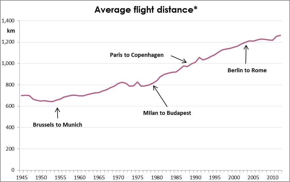
When it comes to environmental impact, flights ain’t flights. The routes included in BITRE “Top routes” list range from 236km (Sydney to Canberra) to 3,615km (Brisbane to Perth). Since 1945, the average distance travelled per passenger per trip has increased steadily to 1,200km (roughly Sydney to Adelaide, or Perth to Karratha). So, not only are Australians travelling more, but they are also travelling further.

Flight Distance 3

* Weighted average, by number of passengers.

This means the overall impact is starting to sound like a Daft Punk song…

Longer, faster, more often…

Or in CO2 terms… more, more, more.

CO2 emmissions per capita

In 2015 Australians will emit more CO2 in domestic flights alone, than the people from the bottom 42 countries emit in total, (roughly 500kg).5

I suppose this is the price of aviophobia  therapy.

_____________________________________________

p.s.: For those wondering, the sharp dip in 1989 is due to the Pilot’s strike:  https://en.wikipedia.org/wiki/1989_Australian_pilots%27_dispute

_____________________________________________

[1] Bureau of Infrastructure, Transport and Regional Economics (BITRE) https://bitre.gov.au/publications/ongoing/domestic_airline_activity-annual_publications.aspx

[2] http://www.economist.com/blogs/graphicdetail/2012/05/daily-chart-8

[3] https://en.wikipedia.org/wiki/World%27s_busiest_passenger_air_routes

[4] Not including Russia, as their figures were not found.

[5] http://data.worldbank.org/indicator/EN.ATM.CO2E.PC

Wealthy fare well from welfare

Wealthy fare well from welfare

In 2013-14, the Australian Government dispersed a Robin Hoodesque $105 billion across the community through income support payments. That’s roughly 30% of its tax revenue. Unlike Robin, however, Kevin, Julia, Tony and their merry men gave much of their loot to the most fortunate, rather than to the poor.

Based on research conducted by the Australian Productivity Commission[1], the wealthiest half of households received just as much income support as the poorest half.  And whilst the poorest decile (10%) received the most support, those in middle upper wealth households (50th to 80th percentile) received the lion’s share.

The distribution of government support to wealthy households is largely driven by Aged and Family pensions, whilst Unemployment, Study and Disability payments go some way to balancing out the situation.

Newstart allowance (a.k.a. the dole) and Study Support programs are tightly targeted based on income and wealth of the recipient. Disability payments are also largely provided to less wealthy households. This leads to claims that the Australian Welfare system is one of the most targeted in the world.

Income Support - Dole and Study

However these two payments only make up 7% of all income support provided by the government.

The majority of the loot is given away in the form of Aged Pensions (44%) and Family Payments (26%).

Income support by payment

Unlike the dole, Aged Pensions and Family Payments are much looser in their targeting.  As a result, more of these benefits are paid to the top wealth brackets than to the poorer households.

Income Support - Pensions

Unfortunately, this appear to create an entirely misguided system in which the wealthiest households in Australia receive more welfare than those with limited resources, to the extent that the amount paid in Aged Pensions to the top 20% of households is $1.2 billion more than the entire unemployment benefits.


This is not to suggest that pension need cutting, nor that the Australian welfare system is over-inflated.

Rather that we’re failing to funnel funds to support those in the greatest need.

____________________________________________

[1] Productivity Commission – Tax and Transfer Research

[2] Image credit: hktang – Flickr – / CC BY – Modified

She was one in 61 billion

She was one in 61 billion

Some figures are so big they are difficult to conceptualise.  Sixty-one billion is such a number.

So let’s start with six…. 6.

Six is the number of weeks a chicken lives for before being slaughtered.

Be it the main dish at Ferran Adrià’s degustation table[1] or a McChicken burger, the breast on your plate is six weeks old.

It may take you a few seconds to process that. Six weeks from hatching to hatcheting.

But while you’re doing so, also contemplate that as there are 61 billion chickens slaughtered yearly[2] (and growing), we slaughter almost 2,000 chickens EVERY SECOND.

No wonder 61 billion is a difficult number to conceptualise.


Speaking of tight quarters, seeing as chickens take three weeks to hatch, they spend a third of their time, from conception to expiration, in an egg.


[1] To be fair to Ferran some free range farms allow their chooks to live to 8 or even 10 weeks, so his breasts may be a little older than 6 weeks.

[2] http://faostat3.fao.org/download

Feature picture is ‘Take five’ by HerbertT available at https://commons.wikimedia.org/wiki/File:Take_five.jpg under a Creative Commons Attribution 2.0. Full terms at http://creativecommons.org/licenses/by/2.0.

From KFC to GFC

From KFC to GFC

It seems you can’t turn your head these days without having an eye poked out by a fried chicken wing.

In the land of foodie-fashion, Melbourne (Australia), fried chicken is running amok. From the eastern KFC variety (Korean Fried Chicken), to American ‘Southern-style’, our feathered friends seem to be cornering the market. And these are only the latest additions to our growing consumption previously satiated by parmas and charcoal chicken.

However, it seems the chicken proliferation is not a new phenomenon, nor is it limited to Melbourne.

Chickens have long been the most populous farmed animal, and their growth in the 20th century has put them in a league of their own. Over the past 50 years the world chicken population has increased 5-fold. It is currently estimated at 21 billion.

Not all chicken farms are growing equally.
Whilst the United States once dominated chicken production, accounting for as many as 1 in 3 chickens killed in the early 1960s, China and Brazil have quickly caught up. China has in fact overtaken the US since 2012, with over 9 billion chickens roaming at any one time.

Whilst these three countries account for around 40% of all chicken production, many other countries continue to increase their production.

That’s a heck of a lot of KFC, chicken biryani, chicken schnitzels, and chicken suffering.


Sources

Food And Agriculture Organization Of The United Nations Statistics Division
World population history

Burning up the runway

Burning up the runway

I often think Facebook is paid by tourism companies to mock my office existence and exaggerate how often my “friends” are on overseas holidays.  But ABS figures[1]suggest Australians really are crossing customs at climate changing rates.

Australians flew overseas 9.3 million times in the 12 months to September 2015. That’s almost 800,000 departures per month. Or in Facebook terms, you can expect more than 3 out of every 100 Aussie friends to travel overseas this month: that’s a myriad mates munching at the Marrakesh markets; a bunch of selfies from Boracay’s beautiful beaches; and the occasional insightfully witticism of the commercialist culture capturing Kolkata.

Australians have long been early adopters of international flights. The first England to Australia flight took place almost a century ago, in 1919 (taking 28 days). Overseas flights, however, have really taken off in the last decades. The number of Australians flying overseas has doubled since 2006, and increased ten-fold since 1977.  Accounting for the population grow, trips per capita have doubled since 2004, and grown six-fold since 1977.

There are many ways of interpreting these figures, depending on what angle / lens / issue you care to focus on.

We could suggest that whilst Australians (according to pop media) are deeply concerned about economic instability and slowing wage rises, they have nonetheless increased their international holidays by 50% per capita since the Global Financial Crisis.

We could similarly insinuate that whilst Australians’ concern for climate change leads them to implement strategies focusing on everyday impacts, they may be undoing all their efforts by ignoring the growth of big ticket items. (The CO2 emissions from a Melbourne to London[2] return flight equate to the yearly emissions per capita for the UK[3].)

Or we could just say “look mum, I’m holding up the Tower of Pisa!” (AGAIN!)

Two-speed tax decrease

Two-speed tax decrease

Seeing as they are one of life’s two certainties, how is it that we’re so ignorant about taxes?
 
The federal government updates the income tax system roughly every second year, more often than not announcing tax cuts.  This kicks off a war of sound bites over who is prepared to deliver the deepest cuts and for whom.  What they rarely provide, however, is a clear and simple indication of what the impact of each tax plan will be on one’s paycheck.  While providing the intended tax brackets allows people to conduct the necessary analysis, I doubt most people would bother to do so, thus making assumptions on the impact of the changes.
 
Since converting the national currency to the Australian dollar in 1966, the average income has increased from just under $3,000 dollars per year to almost $55,000. Although the rate of growth has fluctuated, it has constantly been positive, with no year posting a negative growth.
*There is a break in series in 1981, as figure prior to 1981 are “Average Male Income”, and figures since 1981 are “Total Average Income”


Due to the combination of Australia’s progressive tax system and the continuous income growth, a government’s failure to update the tax system quickly translates into a tax increase.  For example, a person earning $50,000 this year is likely to earn around $51,500 next year due to income growth (average growth of around 4% per year since 1990).  This growth puts a larger percentage of their income in a higher tax bracket than before, therefore increasing their overall tax rate.


The graph below shows what would have happen to a person earning the average wage every year, had the tax rates been frozen in 1990-91.


Although the difference is small from one year to the next, a twenty year time-line clarifies the point.  While the average income in 1990 was $25,910 (falling within a tax bracket of 38.5%), 2011’s average income was $54,700, attracting the top tax rate of 47% back in 1990.


Income tax is a complex beast with many aspects including levies and rebates changing year to year.  In an attempt to simplify the history of income tax in Australia, the following graph displays the percentage of tax paid for different multiples of the average wage from the inception of the Australian dollar onwards.
*The resident Prime Minister is only indicative, as their timing doesn’t line up nicely with the financial years.


Other than a very curious bump in the late seventies*, the years since have not provided much excitement. The slow and gradual “ramp-up” through the nineties is explained by almost a decade of non-updated tax rates, similarly to a small bump in the early to mid ‘naughties’ (2001-2004).  Otherwise it has been a steady decrease of income taxes since Malcolm Fraser’s first term.  


Generally speaking, income taxes have decreased over the past few decades.  This decrease, however, is not evenly spread across the pay brackets.  While the average wage now gets taxed about 4 percentage points less than thirty years ago, people earning 3, 4 and 5 times the average wage have experienced decreases of 9, 11 and 12 percentage points.  This trend is even more pronounced if we used 1985-6 as the base year.  Since Hawke’s first term in office, income tax on the average wage has decreased 2 percentage points, while those earning over 3 times the average wage have experienced a 14 percentage point drop in their income tax!


Interestingly, people earning half the average wage are still paying roughly the same levels of tax as they did in the late 70s, hovering around the 12%.  


Of course, none of this includes the impact of tax breaks for Low Income Earners, nor does it include negative gearing or other benefits offered through our tax system.  It is purely a simple model of calculating income tax percentages, by different multiples of the average wage.  

The picture it tells appear lopsided, though mostly because there seems to be no other side in modern Australian politics.


_________________________


For references:
Tax brackets were sourced from the Australian Taxation Office’s (ATO) website:
http://www.ato.gov.au/individuals/content.aspx?doc=/content/73969.htm
Average Income from the ABS’ Average Weekly Earning’s publication:
http://www.abs.gov.au/Ausstats/abs@.nsf/0/14CDB5CD59F6A075CA2575BC001D6157?OpenDocument