For whom the slots toll

For whom the slots toll

Australians love to poke a pokie. Or so it seems judging by the $12 billion spent every year down the slots. This figure (which accounts for just over 50% of all gambling losses in Australia) is also a significant proportion of Australians’ entertainment budget, almost equalling the $14 billion spent every year on domestic holidays.

But who is dropping all the coins in the slots?

Gambling statistics are notoriously under-reported in surveys, presumably because of our socially undesirability bias (i.e.: we under report things which we think make us look bad, and over-estimate things which make us look good!). This makes demographic data about the people involved particularly hard to find.

(Side note: This bias is so strong that ABS ‘s Household expenditure statistics under-report gambling by a factor of 11; the HILDA (Household, Income and Labour Dynamics in Australia Survey) does better but still under-reports gambling by almost 300%, and pokies by a factor of almost 7.)

We do however, have information about where the money is spent. Assuming most pundits at the local pokies pub are locals, we can say that pokies are the game of choice (or addiction) of the poor and disadvantaged. Pokies expenditure per capita was 6 times higher in Melbourne’s poorest Local Government Areas than in the wealthiest ones. Income, Disadvantage indexes and Newstart payments (unemployment benefits) all correlate strongly with pokies losses.


It’s unclear how accurate these estimates, however, I reckon they’re probably underestimates of how well correlated these characteristics are. I assume poor folk play the pokies in their local pubs, as well as sometimes at pubs in town, or in “destination” areas. I doubt this is the case with folk from richer areas travelling to poorer, less hip areas to play the pokies. Also, I think the expenditure in the CBD and inner suburbs (the wealthy ones) is over represented in tourist expenditure. Therefore, I think the “per capita” for rich locals is actually less than the figures calculated above, and the poor folks’ is underestimated. This suggests to me that the correlation is stronger than the figures show.

Surprisingly, at least for me, pensioners and the aged do not correlate highly with pokies.

I’m not generally a fan of paternalistic rules. And I dare say most people play the pokies as a form of entertainment. But I’m willing to consider them when they target addictions, especially those affecting the more vulnerable among us.

Perhaps it’s time to heed Tim’s message and blow up the pokies… or at least consider the PC’s recommendations and introduce some limitations.


Helping all – UK’s distribution of public funding

Helping all – UK’s distribution of public funding

Redistribution of funds through tax can happen in one of two main ways:

  • you collect more from the rich than the poor and give everyone an equal share, or
  • you collect the same amount from everyone and distribute more to those in most need.

Gov Exp 1


But how much is the UK doing of either?

In short, relatively nothing on the first type of distribution, and not a lot on the second.

I say relatively nothing as households across the UK pay roughly the same percentage of their income on tax, no matter what their income. Obviously, those with higher incomes pay larger amounts, but as a proportion, it is not greater than what the poor pay.

On the second type, while the Government does provide greater benefits to the poorer sections of the community, the difference between benefits to the poor and rich is not way near as large as many would have you believe.


Collecting more from the rich

As discussed in a previous post, the amount of tax paid across the community is pretty much the same, relative to their income. So, while the rich contribute the most, they contribute the same percentage of their income that the poor do (when including income tax and indirect taxes).


Are we distributing more to the poor?

According to the latest UK Budget papers, the UK Government will spend roughly “£772 billion in 2016-17”[1].

The budget gets spent as follows:

  • £517 (67%) on services consumed by individuals, e.g. health, education, social security
  • £168 (22%) on untargeted national stuff, e.g. defence, paying debts, public order
  • £87 (11%) on services which may or may not support some over others, but it’s harder to ascertain its distribution, e.g. agriculture, industry, employment, transport

For the purposes of this post, I will ignore the 11%, as I can’t find reasonable distribution analysis, and what’s 11% anyway.

Gov Exp 11

So, how do targeted services get dispersed across the income groups?

Health

Health accounts for 19% of all UK Government expenditure, with the average household in 2013/14 consuming around £4,200 in services.  While obviously not every household consumes the same amount, the difference across income groups is surprisingly small.

Gov Exp 2

That’s to say, households from across the various income groups in the UK consume just over £4,000 worth of health services. Those with the lowest and highest incomes appear to consume slightly smaller amounts.


Education

Consumption of education services does vary. In 2013/14, the poorest 3 deciles consumed just over double what the richest 10% of households did.  This difference, however, appears to be largely driven by the number of students in the house, rather than their income.  Students (from primary school to university) are twice more likely to live in the poorest 30% of households than in the richest 10%.  After adjusting for number of students per household, education expenditure is remarkably similar across the income ranges.

Gov Exp 3

(As student estimates are rounded to 1 decimal place, the estimates graphed include an unrounded range, e.g.: the poorest households have 0.7 students per house, but are graphed from 0.65 to 0.75)


Social Protection & Personal social services

Unlike health and education, social protection and personal services are targeted based on income. But even these payments are possibly less lopsided than is expected.

The poorest half of the community receives 80% more than the bottom half. While the average household receives £6,000, the 2nd and 3rd poorest received the most, at £9,000. The richest and second richest deciles, on the other hand, received £2,400 and £3,500 per year respectively.

Gov Exp 35


When you add it all up

Other than social security, which is mostly targeted at the lower middle class, the majority of government spending is spread out quite evenly across the income groups. The end product, being one that while leaning towards supporting the lower middle class, provides a relatively equal distribution.

Gov Exp 4

*not including 11% spent on Agriculture, Transport, Industries, etc.


Sources

[1] https://www.gov.uk/government/publications/budget-2016-documents/budget-2016

http://www.ons.gov.uk/peoplepopulationandcommunity/personalandhouseholdfinances/incomeandwealth/datalist?filter=datasets

Parliament photo by : luxstorm – https://pixabay.com/en/users/luxstorm-1216826/

Equality: what progressive income taxes giveth, consumption taxes taketh away

Equality: what progressive income taxes giveth, consumption taxes taketh away

There are two broad types of taxes: direct and indirect.

Direct taxes are charged directly by governments, usually on income. This facilitates progressive targeting, taking more from high earners and alleviating the  burden on the poor.

Indirect taxes (e.g. VAT, GST, fuel and tobacco levies) are charged by anyone providing a good or service upon consumption. And the 7Eleven down the street doesn’t know whether you are rich or poor. So a chocolate bar will incur a 20% tax, whether you earn £10,000 or £100,000.


How much does this matter?

The impact of indirect taxes depends on how much you earn. Unfortunately, the less you have the more it impacts.  While income tax progressively increases as your income increases, consumption taxes are regressive. As a result the poorest 10% of UK’s households spend a third of their income on indirect taxes.  The richest 10% on the other hand only spend £1 of every £10 they earn in indirect taxes¹.

Indirect Tax UK 1

The impact of these regressive indirect taxes are such that they cancel out the progressiveness of the income taxes.  That is, once both sets of taxes are considered; households across the UK’s income spectrum contribute the same amount relative to their income. In fact, the poorest 10% of households contribute 10 percentage points more than any other income group.

This trend grew drastically from the late 70s till 2002, and appears to have plateaued since. But it does not appear to be disappearing.

Indirect Tax UK 2


But, what if…

…  the UK got rid of indirect taxes. What if it raised the same revenue as it does today entirely through income taxes, using its current progressive pattern?

Using this ‘what if’ scenario, some measures of inequality would be almost halved:Indirect Tax UK 4

To put the Gini value in perspective, the estimated 0.26 value would put the UK among the most equal countries, alongside Norway, Finland (based on UNDP figures²).


Indirect Tax UK 3

Removing the VAT by itself would make a significant impact, as it accounts for almost half of all indirect taxes.


Reality check

Granted, moving to an entirely direct revenue raising system is neither likely nor simple. But this ridiculous scenario does highlight just how unequal the indirect taxing system is, and what impact it has on equality.

It also suggests that every new or increased indirect tax implemented continues to drive a wedge between the haves and the have-less. This includes the increases in VAT from 15% to 17.5% to 20% over the past 25 years, and any additional levy.

Similarly, if a key aim over the coming years is to decrease inequality, then there may be worse places to start than by lowering VAT, and compensating where necessary with increased income taxes.


Sources:

[1] http://www.ons.gov.uk/peoplepopulationandcommunity/personalandhouseholdfinances/incomeandwealth/datasets/averageincomestaxesandbenefitsbydecilegroupsofallhouseholds

[2]  http://hdr.undp.org/en/content/income-gini-coefficient

They may take away our lives, but they’ll never take our freedom to drive!

They may take away our lives, but they’ll never take our freedom to drive!

Petrol today costs around 40% more than it did 12 years ago, after adjusting for inflation, but Australians still drive like it’s going out of fashion.  Australians have defied the petrol bowser again and again since the 90s, bringing into question what impact some government policies may have in curving our enthusiasm for the wheel. Seems there is no pricing Australians out of their cars.

One of the ways in which governments hope to influence people’s activities and consumption is by affecting prices. All things being equal, increasing costs is meant to decrease consumption.  And decreasing consumption should decrease environmental impact.

Cars petrol links


Yet, Australians are unwilling to let go of their car keys, despite the cost blow out.  Petrol prices increased 51% from 1998 to 2008, and while they’ve dropped slightly from the peak, they are still 35% higher than in the late 90s. Beyond the whinging and media focus on the topic, Australians’ driving habits appear unfazed. Passenger vehicles travel between 7,200km and 7,700km per person every year since the late 90s, with only minor variations each year.

But not only are Australians not driving less, they’re also moving towards less fuel efficient SUVs over sedans.

SUVs cars sales

So, are Australians too wealthy to be easily manipulated by monetary pressures?

An AC Nielsen survey in 2006[1] suggested 60% of Australians were decreasing their car use to deal with the price increases. But it seems people overestimate their willingness or ability to update their behaviours according to their environment.  Increased petrol prices definitely led to increased snarling at the local servo. But people kept find themselves sucking on the bowser’s tit, much like the electorate with the major parties: they don’t like it, but are too lazy to search for other options.

Unless there’s a party willing to go beyond a 50% tax increase to test how elastic the petrol guzzlers are, what chance do governments have to guide behaviour through tariffs.


Sources

http://www.aaa.asn.au/aaa-agenda/affordability/latest-fuel-prices/

http://atrf.info/papers/2010/2010_gargett.pdf

http://stat.abs.gov.au/OECDStat_Metadata/ShowMetadata.ashx?Dataset=ERP_QUARTERLY&ShowOnWeb=true&Lang=en

ABS : 6401.0 Consumer Price Index, Australia, TABLES 1 and 2. CPI: All Groups, Index Numbers and Percentage Changes

[1] http://www.smh.com.au/news/business/aussies-changing-driving-habits-to-cope-with-fuel-prices/2006/03/07/1141493652510.html

Affordability, it’s a matter of expectations

Affordability, it’s a matter of expectations

There is no doubt that Australian property prices are increasing at a rapid rate. Affordability, however, may depend on expectations.

There is a difference between something being unaffordable and it rapidly increasing in price. The topic of housing affordability has been on high rotation in Australian politics for the past few years.  It’s the pinnacle of two topics du jour: Capital Gains Tax and Negative gearing. Much has been written about the impact these two policies have had on house-prices since the 1980s.  However, most articles focus on the speed of the price increase, not on whether houses are relatively ‘affordable’?  What is affordable? Would we think houses affordable if prices dropped by a third?

Much was made of Turnbull’s interview with the one-year-old who negatively geared property (or at least her parents did), and how out of touch the sentiments of the interview were. But it is generally acceptable, on the other hand, for a couple with a 4-month-old to own a home with spare rooms¹.

“We don’t have unreasonable expectations, but those three-bedroom apartments and townhouses are cost prohibitive ….” said Ms Rule-Layton, Coburg.

Census figures show that when it comes to young families with one or two children, spare bedroom(s) are by far the norm, not the exception.

Of the 207,000 couples with one child owning (or paying off) a home in 2011, 91% had at least one spare room. Almost half of these had 2 spare bedrooms or more.

The situation is surprisingly similar for single parents with one kid.  More than 4 out of 5 had at least one spare bedroom, and 27% at least 2.

When it comes to 2 children families, the question of spare bedrooms is slightly more complicated as the issue of sharing bedrooms arises.  Statistics usually show you how many people and rooms there are per home, but not whether kids share rooms making others spare, etc.  However, only 3 in 100 home-owning couples with 2 kids had insufficient rooms for their kids not to have one each.  This figure only rises to 5 in 100 for single parents with 2 kids.

Couples kids rooms

According to the Real Estate Institute of Victoria, 3bdr apartments and houses in inner Melbourne are on average 54% and 32% more expensive than the 2bdr variety.  That roughly equates to an extra $310k for the 3rd bedroom of an apartment, and $285k in a house.

This ratio may not be representative of the whole country but it does suggest that the 3rd bedroom contributes substantially to the price of the dwelling (approximately 30% across the greater Melbourne).

Would homes be deemed affordable today, if the price dropped by this amount?

If families were willing to live without the luxury of a spare bedroom, this saving becomes a real possibility. This relates to the 9 out of 10 couples with one child, and 55 out of 100 couples with 2 children.  Also, to the 42 in 100 families with two kids who have individual rooms.

However, it seems Australians fear room sharing more than they do debt.


The extra bedroom phenomenon is not limited to Australia’s elite. The ratio of houses with at least one spare room is remarkably similar across all socio-economic backgrounds for couples and single-parent families with one child. The difference becomes noticeable on households with 2 or more spare bedrooms.

Couples rooms deciles

Single parentsrooms deciles

And while the spare bedroom, beyond individual kids’ rooms becomes more difficult for the less well-off families, only 9% of the poorest single-parent families don’t have enough rooms for their kids to sleep separately.

Single parentsrooms deciles 2 kids

There is no doubt that Australian property prices are increasing at a rapid rate. Affordability, however, may depend on expectations.

Australia’s housing standards are amongst the highest in the world. The OECD ranks Australia’s housing at 4t4h highest out of the 36 compared in the Better Life Index². Furthermore, within this champagne crowd Australia’s housing costs come a timid 11th cheapest (of the 36) in terms of housing costs vs disposable household income.

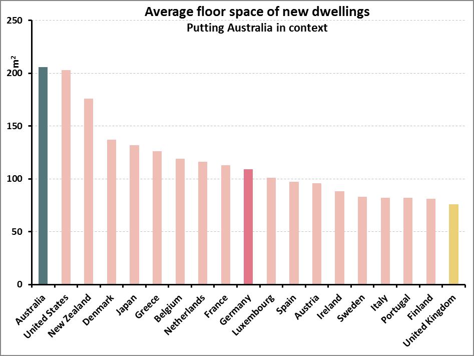
Not only are Australian housing standards particularly high, but they are also improving fast. The average floor-space of new homes increased by almost 40% since 1985³, to 208 metres2 in 2013. To put this in context, the average new home in Germany is 109m2 and in the UK it is 76m2.

Average space home

Based on the best international comparisons I could find4, Australia leads the way in size of new dwellings, easily doubling the size of many European countries’.
Apples w watermellons

So, when we hear international house price comparisons, it’s worth remembering we’re not always comparing apples with apples, but rather their apples with our watermelons.

Does Australia have a housing affordability crisis? It’s hard to say. It depends on your definition of affordable. However, there is a lot of room to move if we want to decrease the cost of housing without lowering our standards beyond what is considered acceptable across the rest of the world’s richest countries.

After all, do we even want our in-laws to have a spare room at our place to crash in?  Save yourself the $300k, and shout them a five-star hotel for the few nights a year they do visit the grandkids.


[1] http://www.domain.com.au/news/melbourne-apartment-boom-is-it-working-for-buyers-and-residents-20160429-gogjvs/

[2] http://www.oecdbetterlifeindex.org/topics/housing/

[3] http://www.abs.gov.au/AUSSTATS/abs@.nsf/Previousproducts/8752.0Feature%20Article1Jun%202013

[4] http://www.demographia.com/db-intlhouse.htm

Smoking the poor

Smoking the poor

Australia’s 2016-17 budget announcement included “four annual 12.5 per cent increases in tobacco excise and excise equivalent customs duties”, claiming it will raise “$4.7bn over the next four years”.¹

This is unlikely to face much opposition. After all, taxing smoking aims to discourage the leading cause of preventable deaths in Australia².

But it’s interesting to see who will be most impacted by this, as smoking is a poor person’s game.

Based on 2009-10 household expenditure data³, increasing the cost of smoking will have a much larger impact on the poorest sectors of the community than anyone else.  More specifically, it will impact households receiving unemployment, disability, and carers payments – those already under the most amount of financial strain.

Smoking poor

Back in 2010, the poorest 20% of households were already spending four times as much of their weekly expenditure as the richest 20%.  Households whose main source of income was unemployment benefits spent three and half times the national average on tobacco, in relation to their total income.  Those whose main income was disability and carer payments spent three times the national average.

This is likely to be much more accentuated today as the 25% annual increase in tobacco excise since 2010 has almost doubled the price of cigarettes since that data was produced[4].

So how will this picture look in 4 years’ time, after 8 years of tobacco increases, when a packet of winnie blues cost $50?

Smoking is addictive. I suspect it’s easier to sell a house than quit smoking. Yet, when governments change legislation, making previous decisions less financially desirable, there’s usually talk of ‘grandfathering’ policies. That is to say that if we ever change capital gains policies we’ll ensure those who got in on the action prior to the changes don’t lose out.  Should similar considerations be made with smokers? Or is this more like the drug dealer who gives away the first few hits until you’re hooked, and then jacks up the prices, marginalising the destitute to a life of crime, imprisonment and social isolation?

I suspect it’s not all bad. Many will quit, thus improving their lives, and those of their loved ones. But for those unable to let go of nicotine’s vice, I suspect health issues will be only part of their worries.


[1] http://www.budget.gov.au/2016-17/content/glossies/tax_super/html/tax_super-05.htm#health

[2] http://www.quit.org.au/resource-centre/facts-evidence/the-big-kill

[3] http://www.abs.gov.au/AUSSTATS/abs@.nsf/Lookup/6530.0Main+Features12009-10?OpenDocument

[4] http://www.tobaccoinaustralia.org.au/13-3-the-price-of-tobacco-products-in-australia

Australians flying off-the-charts

Australians flying off-the-charts

In this age of Cognitive Behavioural Therapy, it seems Australians have coordinated a national group exposure therapy for one of the most common fears… aviophobia.

In 2014, 52 million people boarded domestic flights in Australia¹. That’s 2.2 flights per capita (or 1 return trip per person). Much like the growth seen in International flights, domestic flights have been increasing at almost exponential rates since 1945.

Domestic Passengers per capita

Domestic flights have become such commonplace that the Sydney to Melbourne route (and back) ranks in the top 5 busiest routes in the world²³!

Perhaps even more surprising is that the Melbourne – Launceston route (Australia’s 17th most popular in 2014) was busier than every route in England. In fact, there were only 6 European countries in 2014 (France, Spain, Norway, Germany, Italy and Sweden) with a busier domestic route than Melbourne to Launceston4.

Overall, there are twice as many plane passengers in Australia per capita than the OECD average, when comparing all fights (domestic and international).

Flights by country 2

When it comes to environmental impact, flights ain’t flights. The routes included in BITRE “Top routes” list range from 236km (Sydney to Canberra) to 3,615km (Brisbane to Perth). Since 1945, the average distance travelled per passenger per trip has increased steadily to 1,200km (roughly Sydney to Adelaide, or Perth to Karratha). So, not only are Australians travelling more, but they are also travelling further.

Flight Distance 3

* Weighted average, by number of passengers.

This means the overall impact is starting to sound like a Daft Punk song…

Longer, faster, more often…

Or in CO2 terms… more, more, more.

CO2 emmissions per capita

In 2015 Australians will emit more CO2 in domestic flights alone, than the people from the bottom 42 countries emit in total, (roughly 500kg).5

I suppose this is the price of aviophobia  therapy.

_____________________________________________

p.s.: For those wondering, the sharp dip in 1989 is due to the Pilot’s strike:  https://en.wikipedia.org/wiki/1989_Australian_pilots%27_dispute

_____________________________________________

[1] Bureau of Infrastructure, Transport and Regional Economics (BITRE) https://bitre.gov.au/publications/ongoing/domestic_airline_activity-annual_publications.aspx

[2] http://www.economist.com/blogs/graphicdetail/2012/05/daily-chart-8

[3] https://en.wikipedia.org/wiki/World%27s_busiest_passenger_air_routes

[4] Not including Russia, as their figures were not found.

[5] http://data.worldbank.org/indicator/EN.ATM.CO2E.PC

She was one in 61 billion

She was one in 61 billion

Some figures are so big they are difficult to conceptualise.  Sixty-one billion is such a number.

So let’s start with six…. 6.

Six is the number of weeks a chicken lives for before being slaughtered.

Be it the main dish at Ferran Adrià’s degustation table[1] or a McChicken burger, the breast on your plate is six weeks old.

It may take you a few seconds to process that. Six weeks from hatching to hatcheting.

But while you’re doing so, also contemplate that as there are 61 billion chickens slaughtered yearly[2] (and growing), we slaughter almost 2,000 chickens EVERY SECOND.

No wonder 61 billion is a difficult number to conceptualise.


Speaking of tight quarters, seeing as chickens take three weeks to hatch, they spend a third of their time, from conception to expiration, in an egg.


[1] To be fair to Ferran some free range farms allow their chooks to live to 8 or even 10 weeks, so his breasts may be a little older than 6 weeks.

[2] http://faostat3.fao.org/download

Feature picture is ‘Take five’ by HerbertT available at https://commons.wikimedia.org/wiki/File:Take_five.jpg under a Creative Commons Attribution 2.0. Full terms at http://creativecommons.org/licenses/by/2.0.

From KFC to GFC

From KFC to GFC

It seems you can’t turn your head these days without having an eye poked out by a fried chicken wing.

In the land of foodie-fashion, Melbourne (Australia), fried chicken is running amok. From the eastern KFC variety (Korean Fried Chicken), to American ‘Southern-style’, our feathered friends seem to be cornering the market. And these are only the latest additions to our growing consumption previously satiated by parmas and charcoal chicken.

However, it seems the chicken proliferation is not a new phenomenon, nor is it limited to Melbourne.

Chickens have long been the most populous farmed animal, and their growth in the 20th century has put them in a league of their own. Over the past 50 years the world chicken population has increased 5-fold. It is currently estimated at 21 billion.

Not all chicken farms are growing equally.
Whilst the United States once dominated chicken production, accounting for as many as 1 in 3 chickens killed in the early 1960s, China and Brazil have quickly caught up. China has in fact overtaken the US since 2012, with over 9 billion chickens roaming at any one time.

Whilst these three countries account for around 40% of all chicken production, many other countries continue to increase their production.

That’s a heck of a lot of KFC, chicken biryani, chicken schnitzels, and chicken suffering.


Sources

Food And Agriculture Organization Of The United Nations Statistics Division
World population history

Burning up the runway

Burning up the runway

I often think Facebook is paid by tourism companies to mock my office existence and exaggerate how often my “friends” are on overseas holidays.  But ABS figures[1]suggest Australians really are crossing customs at climate changing rates.

Australians flew overseas 9.3 million times in the 12 months to September 2015. That’s almost 800,000 departures per month. Or in Facebook terms, you can expect more than 3 out of every 100 Aussie friends to travel overseas this month: that’s a myriad mates munching at the Marrakesh markets; a bunch of selfies from Boracay’s beautiful beaches; and the occasional insightfully witticism of the commercialist culture capturing Kolkata.

Australians have long been early adopters of international flights. The first England to Australia flight took place almost a century ago, in 1919 (taking 28 days). Overseas flights, however, have really taken off in the last decades. The number of Australians flying overseas has doubled since 2006, and increased ten-fold since 1977.  Accounting for the population grow, trips per capita have doubled since 2004, and grown six-fold since 1977.

There are many ways of interpreting these figures, depending on what angle / lens / issue you care to focus on.

We could suggest that whilst Australians (according to pop media) are deeply concerned about economic instability and slowing wage rises, they have nonetheless increased their international holidays by 50% per capita since the Global Financial Crisis.

We could similarly insinuate that whilst Australiansconcern for climate change leads them to implement strategies focusing on everyday impacts, they may be undoing all their efforts by ignoring the growth of big ticket items. (The CO2 emissions from a Melbourne to London[2] return flight equate to the yearly emissions per capita for the UK[3].)

Or we could just say “look mum, I’m holding up the Tower of Pisa!” (AGAIN!)

Dumplings stakeholder consultation

Dumplings stakeholder consultation

A few weeks back, in an impatient and self-absorbed move, I ordered dinner for myself and two colleagues as soon as we entered the dumpling bar of choice, without consultation.

Having drunk our way through the evening I was now too hungry to wait to eat, colleague #1 was too bladdery to wait to go to the toilet, and colleague #2 too out-of-focus to read the menu. Being a regular at the restaurant I knew the dishes well and so proceeded to chose a selection of pork and shrimp dumplings (steamed and pan fried for diversity), as well as some fantastic hand-made noodles with pork in a soy-based sauce. Having decisively shouldered the responsibilities as required, and taken care of the unpleasantries, I felt we could now move to more important matters (as soon as #1 returned from the loo that is). What I had not taken into account was that both of my dining companions were vegetarians.

Merde!

This lack of stakeholder consultation (the importance of which I should have learned through my various public servant roles) led to a good belly laugh at my expense and an interesting social situation when I offered to offload a fresh plate of dumplings to the neighbouring table of young HK girls (results: pan fried pork 0 – steamed prawn delicacies 6), but also my wondering whether vegetarianism in Australia had spread so far as to infect public servants. Surely NGOs had that market cornered.

Census fail

Unfortunately, I couldn’t find any conclusive evidence of the changing demography of the vegetarian community to satisfy my curiousity. In fact, I couldn’t even find much data on whether vegetarianism was spreading. However, the trend of meat consumption in Australia is of more interest to me. After all, for moral and environmental reasons, that the total amount of meat consumed is of more importance than the disparity of its consumption. In other words, I think it a better tactic that everyone decrease their meat consumption, even with a stable level of vegetarians, than increasing the number of vegetarians without decreasing consumption in the non-veggo community.

How has Australia’s meat consumption changed over the last decade or so?

My assumption was that due to the growing awareness of issues such as health (red meat and colons), moral (queue a variety of docos on animal rights and current animal mistreatment), and environmental (beef and dairy being one of the biggest contributors to domestic-consumption carbon emissions), consumption of meat in Australian households would have decreased slightly over the past decade. This was also backed up by my anecdotal evidence of being surrounded by vegetarians at dinner tables (even though I hang around a lot less bleeding hearts than I used to!).

Superbite me
From the late 1970s up until 1998 we had a great publication called Apparent Consumption of Selected Foodstuffs (by the ABS), but it’s no longer produced. So, to see the change over the past decade, I did some fairly rudimentary analysis. Based on Household Expenditure figures deflated by CPI (ie: inflation), I tried to work out the change in consumption of different food groups for Australians and found the following:Consumption of “meats” has increased by about 7% per capita. This includes all meats (beef, octopus, spam, kangaroo, barramundi, brains, chooks, bacon, lamb, etc etc etc) which were consumed at home..We also eat 7% more veggies, 11% more fruits and nuts and 15% more eggs! On the other hand we eat 6% less dairy products and 10% less carbs. Sounds to me like Atkins won!

“Meats” tell a story unto themselves.

Red meats (beef, veal, lamb and mutton) are taking a battering, decreasing by almost 20%, while fish and seafood increased by 19%.  The story of the day, however, is the original white meat. Chicken consumption per capita has increased by 60% in the last decade, and that doesn’t even include Nandos.

So, if there are more vegetarians amongst us, they are getting lost in the battery hens. But as far as environmental impact is concerned it appears we’re (very) slowly turning in the right direction. Even though we are consuming more of most things (bad), we seem to be consuming more of the less bad things (veggies, fruit, seafood and chicken), and less of the more bad things (red meats and dairy).

It seems to me that, ironically, the plummeting price of chicken, which probably occurred due to their terrible conditions, has had a much larger impact on our domestic emissions than any keep-cup/green-bag/car-pooling initiative out there.

_______________________________________________________
Big thanks to the ABS for their continuously supporting free access to information:
CPI: 
HES 1998-99: 
http://www.abs.gov.au/AUSSTATS/abs@.nsf/DetailsPage/6535.01998-99?OpenDocument
HES 2009-10: 

Streetlessness – a stationary concern

Streetlessness – a stationary concern

I think we’re selling ourselves short. Way short. Australia has some of the best food I have eaten. Sure, this comment can come across a little small-minded, even jingoistic, but I think there are many ways to justify this, which I hope to remember to go into on a post soon. However, regardless of the quality of our food, I don’t think we’re integrating it into our lives in a memorable and distinct manner. We have kept the act of eating at arms length from our lives.

A list of my most memorable meals, would have a splattering of family gatherings, weekend bbqs, a wedding or ten, and perhaps a few of life’s key moments, (queue the tears of joy, saddened longing stares and elated embraces). But once you normalise the equation of life, and focus on the food and atmosphere, then one thing stands out for me… the streets.

I recently got asked about my favourite meals ever, and of the top of my head the first few seemed to be consumed outdoors, standing up, walking or leaning against some railing dividing me from the adventure beyond it. I’m not, as it might be appearing, suggesting that I’m the outdoors type, but become one at feeding times.

I’m not entirely sure of the reasons behind this. Perhaps it’s the high results-to-expectation ratio, the russian roulette game being played with salmonela, or that any meat appears to be smoke-cured thanks to the passing traffic, but street (or market) food excite me like no other. I, like many, consume most of my meals at home, an eatery (includes restaurant/cafe/bar/etc), or glued to my work-desk. But whilst travelling, much like my modern cohort, I try to include a generous sprinkling of the outdoor variety.

Banana Crepes – Ho Chi Minh City
Unfortunately not only for tourists, but more so for locals, street food is a no-show across Australia!
Our travel guides are full of stories of where to get the best 20 baht pad thai, (Victory Monument – BKK has my vote), how to best match a pilsner to a bratwurst in Vienna, or how many tacos one can get for $2 in Guadalajara, but try picking up a bite on the run in Oz and you’ll probably end up scooping a pie at the 7eleven, or one of the trillion McChickenHuts conveniently located by your right foot.
All this despite a growing demand for these cuisines, with every second restaurant opening in Melbourne offering hawker style food, much like ‘tapas’ recently infested every restaurant and bar in the country like flu-carrying conquistadors. Street Thai, and now Street Vietnamese, are some of the biggest selling recipe books on the market, (and they’re not even a MasterCheff spin off!)
Unfortunately, when trying to bring the streets to Melbourne, they skip the pavement, jump a lane way, climb a staircase, and bring out the linen… a-la-carte anyone?
Chin Chin, one of the latest wonders of Melbourne’s culinary elite, has been described by Broadsheet (http://www.broadsheet.com.au/melbourne/food-and-drink/article/thai-diner-chin-chin-opens) as “street-inspired Asian food”. This much is surely true, but by the time you waited for a free table (20-50 minutes), viewed the menu (1-15), heard the omnipresent spill explaining how the menu is “designed to be shared” (waiter-dependant), ordered and received the plated food, the street cart which inspired this whole situation has crossed 12 red lights, smoked half a packet and sacrificed 7 chickens at the altar of palm oil!
Similarly overcooked is the menu. Unhappy for us to suffer through mediocrity, it’s quality produce throughout. The soups include blue swimmer crab wontons, Hopkins River beef, and Yamba King Prawns. And as wonderful as I assume they all are, (I’ve only tried 1), they were missing the key ingredient: asphalt.
If Chris Lucas were to stand on the corner of Collins and Russell Sts, serving his delightfully sticky caramelised pork with chilli vinegar, sans fanfare and half the price (seeing as the overheads would be nothing but blue skies), then I’d be heading to my nearest Flight Centre and getting myself a piece of that pie! Conversely, Australian cuisine will continue to be a technically proficient orchestra… there’s just no one dancing.