Goats on our roads

Goats on our roads


Seems the latest food fashion in Australian politics is Goat a la scāpé. And it’s being served at both parties.

Politicians are spruiking lowering migration, or at the very least defuse it from the big cities, as it seems foreigners are clogging up our roads. (At least they stopped stealing our sheep!)

The claim seems to follow a simple rationale:
1. Cities (e.g. Melbourne and Sydney) are getting bigger
2. The increase is mostly driven by overseas migration
3. This is putting more people on the roads
4. Hence increased traffic congestion (and insinuations of other social ills)

In short, migrants = traffic congestion. A simple, winning argument.
Except, I’m not convinced it’s true.

Points 1 and 2 are fine. Overseas migration is the largest component of population growth in Australia, particularly our largest cities. Point 3, on the other hand, seems flawed in two ways:

a. The driver: increased congestion could be caused by centralisation of workforce, and
b. Diversity: not all people are equal (in how they travel to work).

While they may appear minor oversights at first, these flaws are so fundamental that migrants may not only be a non-issue, but in fact part of the solution.


Are we jumping to conclusions?

But before we begin, is it worth questioning the conclusion in the first place? How much worse is congestion getting in our big cities? According to the Grattan Institute “the length and time of commutes barely changed in Australia’s biggest cities during the exceptionally rapid population growth between 2011 and 2016. In Sydney, Melbourne, Brisbane and Perth, commute distances in 2016 were almost indistinguishable from 2011″¹.


Let’s focus on Melbourne city to examine this further.

The number of people who work in Melbourne city grew 21% in the period 2011 to 2016, from 347k to 422k². That’s way faster than Melbourne’s overall population increase of 13% in the same period. The increase in CBD jobs may also be driven by the changing make up by industry, i.e. the increase in professional, hospitality, and finance jobs which tend to be more centralised. So, it’s likely there would be more people working in the CBD even without the new migrants.

Yet, even though the number of city workers has increased by 75,000, there’s only 4,000 more people driving into town in 2016 than there were in 2011. That’s because the way in which people travel to work has changed. A smaller percentage drive, and a greater percentage catch public transport, walk/ride or work from home.
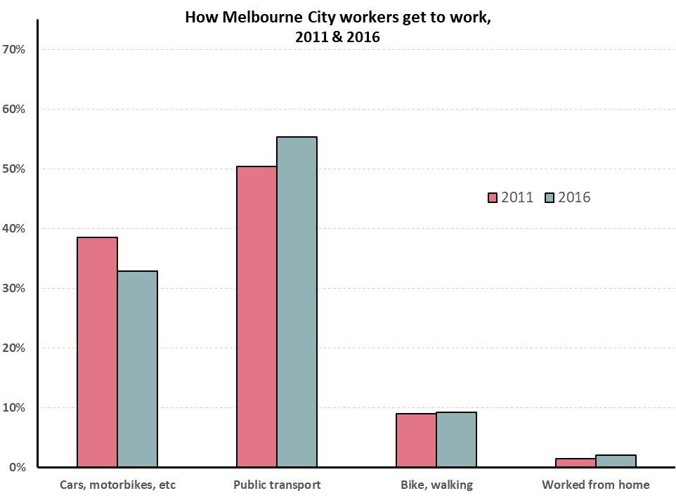
 

This change seems to be led by recent migrants. City workers who are long term Melbourne residents (i.e. have lived within the Melbourne Metropolitan area for at least 5 years) are 2.5 times more likely to drive to work than recent migrants. While recent migrants are almost 2.5 times more likely to walk or ride to work. Workers who moved to Melbourne from elsewhere in Australia (including country Victoria or interstate), fall somewhere in between.


If the percentage of people driving into town had not changed since 2011, Melbourne would have had an extra 14,000 cars on the road in 2016, not the 4,000 increase which occurred.

This of course is also overly simplifying. Congestion would also have changed the choices of the long-term Melbourne residents if they needed to take on city jobs. But I doubt it would have changed them enough as to resemble the choices of recent migrants. This would include large social changes, an increased acceptance of inner-city apartment living, and waving goodbye to the American Australian home-owning dream.

Similarly, Melbourne could move away from its current thriving tech, financial, educational and hospitality industries which centralise the workforce in town. Specially as without the recent migrants Melbourne would struggle to fill those jobs, as the skills may not be available locally.

But in the current world, the fact that such a large percentage of city workers are recent migrants seems to be the main reasons our roads are not at a stand-still.


Sources:

  1. Terrill, Marion, Batrouney, Hugh, Ha, James, and Hourani,Diana (2018). Remarkably adaptive: Australian cities in a time of growth. Grattan Institute.
  2. All travel to work data sourced form the Australian Bureau of Statistics, Census 2011 and 2016.

Two sides of a growth

Two sides of a growth

With all the talk of wage stagnation, you’d be forgiven for thinking Australia lives in struggle town. Yet, incomes have increased so rapidly that today’s full-time median wage would put you in the top quartile 20 years ago!

Real growth

While growth slowed down over the past couple of years, Australians’ income is coming off two decades of boom. The average full-time wage (inflation adjusted) has increased by 41% over the period. This means that even with the increased cost of living, the average Australian worker can now buy almost half as much more stuff than in the late 90s.

But averages only paint a slither of the picture. More impressive is how the increase has permeated across all income levels (albeit to different degrees).

When spreading fulltime workers across an earning continuum, the past two decades have basically moved everyone up at least 20 percentile points.

Today’s median income (the 50th percentile) would put you above the 75th income percentile in 1996. And you only need to be around the 65th percentile to have an income equivalent to that of the top 10th percentile in 1996. Potentially most importantly, today’s poorest 10th percentile earns more than the 30th percentile did in 1996.

Does this mean Australia has eradicated the bottom 20 percentile of workers?

It depends on how you look at it.

A graph may paint a thousand words, but which words depend on your point of view.

Seen through a prism of ‘absolute’ progress, the graphs above suggest Australia has improved drastically. People are richer, and those on the lowest wages are much better off than they used to be.
Those primed for this view of the world will no doubt take that message from this story and have a reinforced idea that the world is getting better; we’re on the right path.

Relative growh

However, seen through a ‘relative’ prism of equality, the graphs highlight the growing gaps between the “haves and the have nots” (even if the have nots have much more than the have nots used to).
The boom was not felt equally.

While the median income increased by 35%, the income of the top decile increased by almost 50%. Meanwhile the 10th percentile increased by 25%. In 1996, the 90/10 percentile ratio was 255%. 20 years later the gap widened to 305%. While the real difference is narrowed by the taxes upon this incomes, it’s fair to say that income inequality has increased.

Real vs Relative

Most people are much better off than before. Yet, many still feel worst in comparison to those around them. The progress and improvements in our lives pale in comparison to comparisons themselves. This may be explained by behavioural economics better than the traditional variety. Perhaps comparing ourselves to those around us might be easier and more front of mind than accurately remembering the past. Perhaps it’s our bias towards feeling losses harder than gains. Whatever the case, I don’t think enough attention is being paid to all the things we have, and too much is being focused on what we’re missing out on. Should we not find a way to enjoy the situation we are in, and not let “comparisons be the thief of joy”1.

We have never lived in an age of such generalised affluence.Our standards and expectations are beyond what any previous generation dreamed of. The growing income, and more importantly wealth inequality are hugely important issues. But we should acknowledge the other side of the graph. Partisans often ignore one point of view fearing it will diminish their own. But ignoring the progress, or overly focusing on the negatives, misleads people to thinking we’re worst off than we are. We start feeling self-pity and fail to acknowledge our place in the world. We should continue to work towards a fairer world, but not at the cost our capacity to enjoy what we have.

Australia is not only at its richest point in time, it’s also among the richest in the place (world).  Perhaps by acknowledging how far we’ve come, we can start paying more attention to helping those beyond our coast lines.

We should fight to make this a better world, but we should not ignore the fact that our world, our time and place, is heaps good.


Sources:

All income data from :

ABS’s Employee Earnings and Hours, Australia

2016: http://abs.gov.au/AUSSTATS/abs@.nsf/DetailsPage/6306.0May%202016?OpenDocument

1996: http://www.ausstats.abs.gov.au/ausstats/free.nsf/0/CE23DC841D70810FCA25722500073754/$File/63060_0596.pdf

1: Disputed quote from Theodore Roosevelt – https://en.wikiquote.org/wiki/Theodore_RooseveltQuote from

For whom the slots toll

For whom the slots toll

Australians love to poke a pokie. Or so it seems judging by the $12 billion spent every year down the slots. This figure (which accounts for just over 50% of all gambling losses in Australia) is also a significant proportion of Australians’ entertainment budget, almost equalling the $14 billion spent every year on domestic holidays.

But who is dropping all the coins in the slots?

Gambling statistics are notoriously under-reported in surveys, presumably because of our socially undesirability bias (i.e.: we under report things which we think make us look bad, and over-estimate things which make us look good!). This makes demographic data about the people involved particularly hard to find.

(Side note: This bias is so strong that ABS ‘s Household expenditure statistics under-report gambling by a factor of 11; the HILDA (Household, Income and Labour Dynamics in Australia Survey) does better but still under-reports gambling by almost 300%, and pokies by a factor of almost 7.)

We do however, have information about where the money is spent. Assuming most pundits at the local pokies pub are locals, we can say that pokies are the game of choice (or addiction) of the poor and disadvantaged. Pokies expenditure per capita was 6 times higher in Melbourne’s poorest Local Government Areas than in the wealthiest ones. Income, Disadvantage indexes and Newstart payments (unemployment benefits) all correlate strongly with pokies losses.


It’s unclear how accurate these estimates, however, I reckon they’re probably underestimates of how well correlated these characteristics are. I assume poor folk play the pokies in their local pubs, as well as sometimes at pubs in town, or in “destination” areas. I doubt this is the case with folk from richer areas travelling to poorer, less hip areas to play the pokies. Also, I think the expenditure in the CBD and inner suburbs (the wealthy ones) is over represented in tourist expenditure. Therefore, I think the “per capita” for rich locals is actually less than the figures calculated above, and the poor folks’ is underestimated. This suggests to me that the correlation is stronger than the figures show.

Surprisingly, at least for me, pensioners and the aged do not correlate highly with pokies.

I’m not generally a fan of paternalistic rules. And I dare say most people play the pokies as a form of entertainment. But I’m willing to consider them when they target addictions, especially those affecting the more vulnerable among us.

Perhaps it’s time to heed Tim’s message and blow up the pokies… or at least consider the PC’s recommendations and introduce some limitations.


Casting geo-blinkers off compassion

Casting geo-blinkers off compassion

Chances are you’re a geographist and you don’t even know it.

Suppose you care about people experiencing homelessness. You come across a local organisation (let’s call them “House the white homeless”) providing wonderful support, but they are actively excluding “non-whites” from their work. You’d probably hesitate to donate to such an organisation. You might even “like” a witty criticism of the organisation on the Facebook for their exclusionary ways.

This may have something to do with our value system. People in our social bubble claim to believe that we should treat all people equally, regardless of what demographic traits fell randomly upon them at birth. People are people, regardless of race, sex, sexuality, or any other  characteristic. But almost by default, most organisations we do support, including “House the white homeless”, focus on homeless people in our local area. They do not support the homeless in Bangkok, Bogota, or Bujumbura.

Why is geography-based discrimination acceptable while other forms of discrimination are intolerable “-isms” in modern progressive societies?

I don’t believe that this discrimination is about where the people are from, but rather where they are in relation to us. For example, when travelling through developing countries we seem to take our geographical care-bubble with us. All of a sudden Bangalorean rough sleepers matter too. As tourists, our empathy is quickly aroused when we see homeless people in the streets of Banda Aceh. But the care-bubble returns to its geographically roots when our holidays come to an end.

Similarly, when we’re back home, many of us support migrants experiencing homelessness as much as locals experiencing homelessness. Like our first example, I think a similar negativity would taint an organisation which works solely with local-born homeless people, let’s call them “xenohomeless”. So it seems that our compassion is not piqued by race or origin, but by geographical location.

Is the homeless woman in Buenos Aires any less deserving of a roof, food and warmth than the rough sleeper near your office? Can we understand her pain any less? Or is it that locals just have better access to emotional advertising?

I reckon we can muster compassion regardless of where the cause is. Compassion may be easier to muster for the people we see in front of us; and it may take a few seconds to bring up for those in countries we’ve visited, to remember what it felt like when we walked past them during our travels; it may even take some effort to muster for those we’ve never seen face-to-face. But I’m pretty sure that when we picture a person experiencing homelessness, we can sense their pain, regardless of what language their street signs are in.

Geographism is not just related to homelessness. It is relevant to most philanthropic areas. The argument above could easily be made for those in need of food, health, education, or any other philanthropic cause. If anything it is only understandable in context of homelessness as you often give directly to the person in need, while with most other causes there is an intermediary agency.

Where someone is lives is one of the biggest contributing factors to their level of need. It’s also possibly a defining characteristic to whether we help them or not (source needed). And while I doubt many of us can justify it as a means of discrimination, we let our geo-blinkers simplify our decision-making, ignoring the vast majority of the world and focusing only on what’s in-front of us.

We’ve come a long way to recognising humanity goes beyond ourselves, our race, and sexuality. Our geographic boundaries should be no different.


Feature pic made in part by elmago_delmar .


Donating à la carte

Donating à la carte

Decisions are hard. Especially when the outcomes are important, the options are numerous, and relevant information is hard to find.

For many everyday decisions (where to eat, what clothes to wear, what to do tonight), I have a pretty good idea of what I can do, what I’d like to achieve, and how likely I am to do so. And despite most of these decisions being largely inconsequential I still consider them in great detail. I assume others are somewhat similar to me, delicately wasting their processing power on life’s minutiae.

Yet, of all the choices we make, one of the most impactful seems among the least rationally considered: donations.

We can donate to almost anything, anyone, at any time. But do we consider the options available before giving? And if so, how are we to weigh up the pain of a malnourished child to the impact of a polluted river; the needs of our local lifesaving club to the suffering of 100 battery hens; climate change to the housing needs of a woman escaping domestic violence?

We’re so overwhelmed by the immense number of possibilities that we often yield to impulse, emotion and social pressures. But these decisions deserve our most careful consideration. We have the power to change the status quo. And to ignore this is to choose to do nothing.

Thanks to the interwebs it’s now as easy to support locally as it is to support (almost) anywhere else in the world. So, we can cast as wide or as narrow a net as we like when looking to get behind a cause.


Modelling donations – a menu of causes

The model below presents the main options available for donations. Its aim is to help us make more conscious decisions, and explicitly remind us of what we’re ignoring.


Using the model – 2 paths to better donations

The model can be used in two ways:
1. Proactively – help guide your thinking when deciding on a cause, and
2. Re-actively –  recognise when a charity focuses on a particular group at the expense of others.


Method 1 is great for clarifying your personal values and systematically prioritising the areas you’d like to support.

Hypothetical example 1: the proactive method
I could start by acknowledging that I care more for people than animals and the environment. Then, I explicitly recognise a desire to help the local LGBTIQ community. Lastly, wanting to have an immediate impact, I support a charity which focuses on providing every-day services. This gives me the following combination:

Using the model as such can help articulate what I’m after, and find a charity which provides the desired service. If all charities were classified using this framework, then I could easily find an organisation to suit my needs.


Method 2 helps remind us of all the things we could be supporting before choosing a particular charity. When donating to a cause, we are implicitly choosing it above all others. The mapping exercise, i.e. explicitly acknowledging what we are focusing on, may highlight an excluded cause which, when considered, we find more worthy.

Hypothetical example 2: Check yo’self

If I’m a long-time supporter of an organisation sheltering dogs, it’s easy to continue doing so by focusing on the wonderful work the organisation does, and feeling great that I could help. However, by mapping their work to the model, I am forced to recognise there are many other animal species in need which I am implicitly ignoring. In fact, others’ need may be greater (either through the amount of cruelty experienced, or the sheer number being subjected to it); for example battery hens or caged pigs. With this realisation I can re-examine my values and act accordingly. If post-introspective I recognise I care more about the suffering of battery hens, then I can go back to Method 1 and better align my donations to reflect my values.


The Four Dimensions of Donations

The model has 4 main dimensions (with the key one broken down into subcategories)

1. The who (including ‘which subcategory’)
This helps differentiates between people, animals or the environment. Each of these key categories is broken down into further subcategories. For example, people can be dissected by religion, or sexuality, or age; animals by species; and the environment by ecosystem (rivers vs rain-forests vs oceans vs desserts, etc.).

2. The where (place)
This helps dictate the place and spread of the donating net. Are you interested in all specimens in the world equally, or do you have a particular attachment or concern over a region over all others?

3. The what (aspect)
Within each category there are different aspects which can be improved or supported. For people, helping improve health or education are pretty central, but there is also work done to support the arts, local sports clubs, churches or world peace. Animals and the Environment also have specific aspects which can be targeted, and these are presented in the model.

4. The how (support)
The how differentiates the different types of work which can help your cause. Should we act now, educate, try to change the decision makers, or continue researching to find better solutions? For example, if you want to help the world deal with climate change, would you prefer to support an organisation providing immediate direct work (e.g. decreasing emissions now) or should more funding be provided towards research in the hope that we discover a more efficient solution in the near future?

By combining the four dimensions, you can have a much better understanding of how you would like to help.


The why

The model does not cover how we do or should decide which box to focus on. That will form another post, hopefully in the near future. But the aim for now was to raise awareness to the breadth of work available, with the hope that before making quick impulsive decisions, we consider what we can do, and hopefully do more with what we give.


To be improved…

It goes without saying that this model is probably missing a whole bunch of stuff. So please let me know what’s missing so I can update it as we discuss.

Updates:
1st: Indigeneity and migrant status – from our UN correspondent! (How did I miss them?)
2nd: Biodiversity – Thanks Ms Sabrewing
3rd: Circumstance – From a recent dinner discussion, mentioning “Legacy”


The following documents were used in the development of this model:

NGOs
Guidestar: http://www.guidestar.org/NonprofitDirectory.aspx
Charity Navigator: https://www.charitynavigator.org/index.cfm?bay=content.view&cpid=34
Government organisations
UK – http://www.legislation.gov.uk/ukpga/2011/25/contents
USA – https://www.irs.gov/pub/irs-pdf/p4220.pdf
Australia – http://australiancharities.acnc.gov.au/


They don’t make rates like they used to

They don’t make rates like they used to

Australian mortgage affordability has not changed in over 20 years.

This statement needs a pinch of caveats and a blanket of context, but when all is said and done housing costs have been surprisingly steady.

I didn’t want to write about housing affordability so soon after we checked our privilege, but a Fitzsimmons article in the Sydney Morning Herald piqued my interest. In it, Fitzsimmons focuses on two key affordability ingredients: interest rates and house prices, concluding that “younger Australians definitely have it tougher when it comes to housing affordability”.

There are many ways of measuring housing affordability, but I find Fitzimmons’ measure of choice to be more relevant than most. What proportion of a household’s income is spent on mortgage repayments. According to the article, in the late 80s and early 90s:

“When interest rates were 17 per cent, the proportion of household disposable income that went on the interest payments for the home loan was 6.1 per cent. It’s currently 6.8 per cent.”

These figures metaphorically killed my cat. If interest repayments are below 7%, then why all the commotion?

I believe the article is wrong about the figures, but nailed their consistency.


(Data sources for graph in notes below.)

 
According to data from the Australian Bureau of Statistics, households spent around 24% of their disposable income, on average, on mortgage repayments in 2010. Over half of which went to paying off the interests alone. Mortgage costs as a percentage of gross household income (I’ll use gross instead of disposable from here-on-in as it’s more readily available) have been steady since at least 1993, bouncing between 19% and 23%. Some of this fluctuation may even be ‘margin of error’ as the figures are roughly +/- 2%.  So servicing mortgages now appears at worst as affordable as back in the 90s and 2000s. At best about 4 percentage points lower than in the mid-90s. Repayments were a little smaller in the 80s but the difference is not as big as I expected (15% in 1984 and 18% in 1988-89). Some of this difference is also cushioned by decreasing costs of related items such as furniture and household equipment, which has halved in relative cost compared to 1984 (down from 6% of household income to 3%).

Also, while the outlay in the 80s was smaller, a larger proportion of the repayments were spent covering the interest rather than going towards decreasing the debt.


What about outside of our beautiful borders?

Affordability seems to me more relative than absolute. Australian mortgages may not have changed much in the last decades, but how do we compare to other countries? Lacking an internationally recognised standard for such a measure I was only able to research other rich English speaking countries (my French, Arabic and Chinese aren’t quite up to scratch). And from what I gathered, repayments here are comparable to those in Canada, UK, USA and NZ.


None of this talks about people’s difficulty in breaking into the market, nor how hard it is for low income families to afford a home of their own. But it does suggest that Average Aussie Anne’s situation is not special. Housing has been at similar levels for a while, and it is also at similar levels in other similar countries. So, either the level of affordability is fine, or it’s equally un-affordable elsewhere/else-time.

Also, if the situation is so similar in other countries which have very different taxation systems, with or without such policies like Capital Gains, Negative gearing, and building controls, then ‘solving’ this may not be as easy as some suggest.


Sources

  • The Graph 1 is made from 2 different sources:
  • The Household Expenditure Survey, detailing Interest and Principal Payments separately.
  • The Housing Occupancy and Costs Survey which only provides a total amount. This survey only has “housing costs”, which also includes rates, etc. To account for this, estimates for non-mortgage costs are derived by subtracting the value of “Owner without a mortgage” from “Owner with a mortgage”. It isn’t perfect, but I believe it accurate enough for this purposes.
  • Australian data:
    http://www.abs.gov.au/AUSSTATS/abs@.nsf/DetailsPage/6530.02009-10?OpenDocument (various years)
    http://www.abs.gov.au/ausstats/abs@.nsf/PrimaryMainFeatures/4130.0?OpenDocument
  • USA:
    https://www.census.gov/programs-surveys/ahs/data/interactive/ahstablecreator.html#?s_areas=a00000&s_year=n2011&s_tableName=Table10&s_byGroup1=a7&s_byGroup2=a1&s_filterGroup1=t2&s_filterGroup2=g1https://www.census.gov/programs-surveys/ahs/data/2005/ahs-2005-summary-tables/h150-05.html
  • UK:
    https://www.ons.gov.uk/peoplepopulationandcommunity/personalandhouseholdfinances/incomeandwealth/compendium/familyspending/2015/chapter4trendsinhouseholdexpenditureovertime
    https://www.ons.gov.uk/peoplepopulationandcommunity/personalandhouseholdfinances/incomeandwealth/compendium/familyspending/2015/chapter2housingexpenditure
  • NZ:
    http://www.stats.govt.nz/browse_for_stats/people_and_communities/Households/HouseholdExpenditureStatistics_HOTPYeJun16.aspx
  • Canada:
    http://www5.statcan.gc.ca/cansim/a47
    http://www12.statcan.gc.ca/nhs-enm/2011/as-sa/99-014-x/2011002/tbl/tbl03-eng.cfm

Is it time to check our (housing) privilege?

Is it time to check our (housing) privilege?

1.

The Australian real estate market is off the charts. International comparisons recently published by The Economist confirmed Australia and New Zealand’s housing costs outpaced Europe and North America over the past few decades.

Fortunately for most of us, there are simple solutions which Australia is well placed to take advantage of.


2. Banana republic

When Cyclone Larry hit the Australian shores in 2006 it sent bananas sky high. As the winds decimated the plantations prices increased 600%; from around $2 to $12 a kilo in a matter of weeks. Cyclone Yasi repeated this feat five years later, reaching prices of $15 a kilo.

I love banana smoothies as much as the next guy, so I have rather unpleasant memories of 2006 and 2011. Not a single banana smoothie or pancake in sight, as we all avoided prices akin to today’s smashed avocados.

I, like many of my fellow sufferers, turned to foreign cook books in search of alternatives. I experimented with mango lassis and opened my heart and mouth to strawberry crepes. And while I often dreamt of cavendish fields and lady finger delights, the alternatives had benefits too.

The following years’ harvests were back to normal, and so were the prices. Banana smoothies regained their place upon the thick-drink throne, but I also continued to indulge on the occasional lassi and added crepes to my repertoire.


3. How about them apples

The House-Price Index (HPI) used for comparisons such as The Economist’s includes houses, apartments and other dwelling types. To measure inflation accurately the HPI mirrors the ratio of dwelling types found in the local housing stock. Across the EU roughly 42% of people live in apartments. In Canada and the US the figure is 25% and 21% respectively. Australia, on the other hand, only houses 10% of people in apartments.


One could argue that Europe is structurally different to Australia, with ancient cities and smaller landmasses. But Canada and the US are both quite similar to Australia when it comes to land mass, age and culture. Yet, Australia’s housing stock is half as likely to include smaller units. When you consider that another 6% of Americans (on top of the 21% in units) live in small dwellings such as mobile homes, caravans, etc, Australian’s propensity for houses seems even more like an outlier.

While Ireland and the UK have similar housing ratios to Australia, the majority of them live in “semi-detached” houses, meaning they share at least a wall with their neighbours (terrace and row housing). 90% of Australians, on the other hand, live in fully detached homes; back-yards, front-yards, side-yards. This type of housing has much larger land lots.

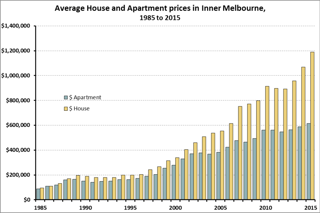
Over the past few decades, Australian house prices increased roughly 20% faster than apartment prices. This difference is more pronounced in sought-after areas such as the inner city suburbs where land is at a premium. Due to the compounding effect over a 30 year stretch, this difference in speed means that houses in Stonnington went up 13 times but apartments only increased 7 times.


4. A home among the gumtrees

Such is Australians’ addiction to land (or disdain for apartments) that people choose to live an hour away from the CBD than being stuck in an apartment. In 2015, the average price for a house in Nillumbik Shire was $50k to $70k more than the average apartment in City of Yarra or Melbourne Council ($696k vs $640k and $624k). Nillumbik is roughly 40km from Melbourne’s CBD, and around an hour by train. Similarly, houses in Knox and Maroondah Shires (about 30 kms east of the CBD and 1 hour by public transport) are $80k more on average than the apartments in City of Yarra, and about $50k more than in Port Phillip($682k). Port Phillip is not only just a few kms from town, it’s also on the beach.

The average price of an apartment in the blue LGAs (as depicted in the map below) is cheaper than the average house price in the red LGAs. Houses in the yellow LGAs are cheaper still.
This phenomenon is not limited to big families and households. According to the 2011 Census, only 30% of lone person households in Melbourne lived in apartments, and 17% of 2 person households. Australia wide, only 26% of 1 person households and 14% of 2-person households live in apartments.


5. Compare the pear

Of course these comparisons are a bit strange. Suburban homes have more rooms than inner city apartments. They have yards and land; all good things for some. On the other hand, apartments are close to employment, cultural and retail opportunities, not to mention public and social goods, such as hospitals, public transport, etc, etc. And while the majority of people seem to choose houses, apartments make fine homes too; 42% of Europeans seem to cope.

As the house price index mirrors the local housing stock, the Australian HPI is 90% weighted towards houses. This pretty much hides the lower speed at which apartments increase.

But potentially more importantly, the difference between house prices and apartment prices may be inflated due to houses making better investments. If people bought houses purely for their liveability and not with an eye to their resale value, then perhaps the difference in price would be smaller. Perhaps some of the Australian “housing affordability issue” can be put down to being an “investment affordability issue”.

Some might say that apartments are not the Australian way. Many have fond childhood memories of backyard cricket and jumping over sprinklers to keep cool in summer. However, cities like Melbourne have tripled their population since the 50s, and doubled since the 70s. As the population increases houses need to be built further and further away from city centres in order to stay affordable. This is clearly the current thinking as the Victorian Government recently announced the rezoning of 17 new suburbs to house 100,000 new houses. This would all be fine, except that we’re encouraging people to live roughly 40kms out of town.

Apartments, instead, can already be built cheaply within a 15km radius of the CBD.


6. Mango or papaya?

Comparison is a cruel mistress. Australians feel hard done by when comparing certain aspects of their lives to a place which no longer exists in time and space (1960s Melbourne), but they fail to recognise their relative comfort in comparison to pretty much everyone else in the world today.

Apartment living is not for those who can’t afford a house. It’s for those who have different preferences, like valuing commute time over backyards. And when our tastes and preferences become out of reach, it might be worth opening our minds to other possibilities, consulting foreign cookbooks and considering other fruits.


7. #notallfruits

The term “housing affordability crisis” in this post refers to the current focus on “young Australians’ inability to break into the market“, or that “housing is out of reach of the average Australian“.

It does not discuss the issue of un-affordable rental markets and people struggling to secure a safe roof on an everyday basis.

Rental affordability is a completely different issue and using the same term to discuss both problems is somewhat problematic.

I discuss the rental aspect of housing affordability in these previous posts: Those who can’t afford, rent; and Rental struggles

_____________________________

Sources

  1. All Melbourne house and apartment price info from: http://www.dtpli.vic.gov.au/property-and-land-titles/property-information/property-prices (Statistics (XLS 1.2 MB))
  2. Population distribution by dwelling structure: European countries, America, Canada, NZ, and Australia
  3. Cyclone information – https://www1.ncdc.noaa.gov/pub/data/cmb/bams-sotc/climate-assessment-2006.pdf
  4. Front graphic by LioPutra

Two-speed houses driving inequality across the city

Two-speed houses driving inequality across the city

If you’re looking for a house which appreciates as much as you appreciate it, then you can do worse than the most expensive suburb you can afford. Why? Because it seems that the speed at which a house’s value increase is related to the value of the area it’s in. Expensive area = faster growth. This two-speed real estate market has had a significant impact on inequality across the community.

The property boom has been so prominent that it propelled FOMO to expensive new heights. But this boom has not been felt evenly across Local Government Areas (LGAs). For example, the average house price in Melton City (a relatively cheap area in Melbourne’s west) increased 15% in the 5 years to 2015 (from $354k to $406k). Over the same period, houses in Stonnington City, a very wealthy area, went up by 61% (from $1.5 to $2.4 million).

Stonnington and Melton are obviously hand-picked examples, but the rule generally holds; at least within the Greater Melbourne Metropolitan area.

Dividing Melbourne’s 30 Local Government Areas (LGAs) in quintiles, average house price in the most expensive LGAs (including Bayside, Yarra and Boroondara) increased 7.3% per annum between 2010 and 2015. Mid-priced areas such as Moreland and Banyule increased 4.3% p.a. And the poorest areas of Melbourne (e.g.: Whyndham, Hume, Frankston) only increased 2.5% p.a. To put this in perspective, inflation for the same period was 2.3% p.a.


This correlation between price and growth appears to hold for the past 30 years, (as far back as the dataset goes). However, the last 15 years are slightly more accentuated. If we look at the growth since 1985, richer areas have grown about a third quicker than poorer areas.


It also does not seem to be the result of Hogwarts’ Capital Gains Tax, brought in in 1999, as a very similar pattern existed in 1998 (pre-CGT).


So what does this mean?

Seeing as Australian households hold half their wealth in real estate on average, the difference in speed at which these investments increase has a huge bearing on (in) equality; especially as wealth is a much bigger determinant of inequality than income is.

Unfortunately, there is only one ‘people’ who are in a position to buy houses in the South Yarras, the Tooraks, the Brightons and the East Melbournes of Melbourne – the rich people. Other peoples will not fare half as well.

Back in 1985 the average house in the most expensive LGA was worth 3 times a house in the cheapest LGA. That ratio is now 6.

This is driven by a divergence at both ends. While the cheapest LGAs have slowly decreased from around 63% of Melbourne’s overall average to just over 50%, the most expensive, have shot up from 1.9 times Melbourne’s average to 3 times.


So, while neither of these two houses is producing anything of value, rather just sitting on their nest eggs, by virtue of affording a pricier egg, them rich folk will taste the tastier fruits of no labour. (In fact, an average house in Stonnington makes more money per year than around 90% of taxable individuals in Australia!)

If this pattern continues, the wealth gap will open wider each year. Releasing land for residential growth in the outskirts of the city may not be the answer. This would further distance the less well-off and new home owners from the areas where growth is concentrated. Meanwhile as populations increase a larger market appears in the sought-after areas. This in turn drives up their value, concentrating capital, and further distancing themselves (financially and geographically) from other “peoples”.

If, like the old Australian adage states, Jack’s house is as good as her mistress’s, their land certainly isn’t.


Source:

All house price info from:  http://www.dtpli.vic.gov.au/property-and-land-titles/property-information/property-prices (Statistics (XLS 1.2 MB))

Wealth data from table 8.2 linked

Tax data from Table 16 linked

Feature picture fusion of

https://pixabay.com/en/cottage-house-small-summer-3d-1663741/  &

I, Tennen-Gas (https://commons.wikimedia.org/wiki/File:Mitsubishi_Supershift_001.JPG


What if Joe and Jessie asked you for money

What if Joe and Jessie asked you for money

As you leave the office on a miserably cold night, you walk past two people asking for money on the street.

If you are the giving kind, this appears like a charitable situation.


You have enough cash in your pocket, but who do you help? Do you give money to one and not the other? Do you give them both equal amounts? How do you decide?


home-4330610901_8d9b3d2f97_b


Suppose you know that one of them, let’s call them Joe, lives by themselves, while the other, Jessie, supports a family of 4.

Does this help you decide?


Suppose now, that after observing the situation for a few seconds, you notice that Joe has already collected $85, while Jessie only has $15. Does this help you make up your mind?


You then remember that due to societal quirks, Joe has access to a free warm meal, morning and night, while Jessie uses whatever money they collect to feed themselves and their 3 kids.   Does this help you decide?


home-canihaveabeerman


Should it even matter what Joe and Jessie do with the money you give them? What if Joe ‘invested’ their funding at the casino convinced he’d figured out a way to beat the house, while Jessie was investing in their kids’ education?

Does this make the decision easier?


Lastly, but definitely not leastly, imagine Joe grew a patchy, if not comical moustache.

Would this change your decision?

What if he said he’d walk 10km, or do 20 push-ups for 20 days?


Deciding who to help is not always easy, but surely we can do better than to be guided by marketing campaigns and gimmicks.

Perhaps we can start by figuring out what we’re trying to do when being charitable, and then working out the best, or at least a half-decent way of achieving this.


Pics:

Feature: Andy Burgess, Homeless guy on Yonge Street, CC BY 2.0

Need Money 4 Food: https://www.flickr.com/photos/9600117@N03/ (no changes made)

Money for beer: AlBErto Gottardo / Alberto Gottardo, CanIHaveABeerMan, CC BY-SA 2.0

How bad is bad – rating cancers

How bad is bad – rating cancers

Around 125,000 Australians will be diagnosed with cancer sometime this year. That’s just over 5 new cases per 1,000 Australians. Chances are, someone I know knows some one being diagnosed this year, and they’ll tell me about it. Cancer is never good news. But they’re also not all the same. While some are hard to beat, others have very decent survival rates.

So how bad is my mate’s mate’s cancer?

(This post focuses purely on the likelihood of death as a measure of ‘badness’.)


Some are deadlier than others

One method of comparing a condition’s “deadliness” is the mortality-to-incidence ratio (MIR). The MIR denotes the number of people who die of a particular cancer in a given year, to the number of people diagnosed with the same cancer in the same year. The ratio ranges from 0 to 1, and the lower the value the longer one is expected to survive.  A MIR of 0 means no one dies of that particular cancer.

The 10 most common cancers in 2012, in terms of incidence, accounted for 71% of new cases. These cancers, listed below, have MIRs ranging from 0.13 to 0.90. That’s to say, some common cancers are 8 times as deadly as other common cancers.

Cancers aint cancers 1


In short, lung and pancreatic cancers have a much worse outlook than prostate, breast or melanomas.


Visualising MIR’s results

The MIR has a huge impact on how many people die from a particular cancer, compared to how many are diagnosed with it. For example, even though prostate cancer impacts 8 times as many people as pancreatic cancer (20,637 vs 2,383), both claimed roughly the same number of lives in 2012 (3,173 vs 2,437). The graph below shows the incidence and mortality of Australia’s 21 most common cancers.

Cancers aint cancers 2


How bad is bad: not as bad as it used to be

Huge improvements in survival rates are being made across most cancers. Over the past 30 years, 8 of the top 10 cancers saw large drops in mortality ratios. The two most common cancers, prostate and breast, are now less than half as deadly as they were in the early 1980s. Unfortunately, progress has been less effective for bladder cancer, which has in fact gone backwards, by 39%.

Cancers aint cancers 3

* 1982 MIRs are age-adjusted based on the 2012 population, to make the figures more comparable.

** Care must be taken when comparing colon and rectal cancers  over time, as it is likely that the figures are disturbed by coding changes, thus may not reflect real changes in survival rates


Neither me nor my mate’s mate get a say on which cancer they have, but it does help to know that treatments and support are improving every year.

Salud


Source:

All data used sourced from the AIHW’s Australian Cancer Incidence and Mortality (ACIM) books.

http://www.aihw.gov.au/acim-books/