More charity at home, less in Parliament House

More charity at home, less in Parliament House

While Australians are increasing their personal donations, as a country they’ve been giving less and less to foreign aid.

Charity vs ODA

Is this suggesting a misalignment of sentiments between the community and its leadership? Is there a growing desire to support those closest to us, donating to support local causes, while diminishing our desire to help those abroad?

The period graphed included 9.2 different Prime Ministers so it’s hard to pin point the blame the Australian Government’s diminishing willingness to fund foreign aid. And while the coloured timeline suggests that upon winning office Labour increases and Liberal decreases Australia’s Official Development Assistance, the overall picture is clearly trending south. So much so, that Foreign Aid didn’t even rate a mention during the 2016 election campaign.

Australia’s generosity, as individuals and as a country however, leaves much to be desired.  Australians donate around 34 cents for every $100 earned, and the country spends $1.30 in foreign aid for every $100 spent in the federal budget.

But if charity is starting to take off at home, there’s hope it may influence the political agenda.


ODA vs Budget not ODA vs GNI

The graph shows foreign aid expenditure as a percentage of the total federal budget.  Most analysis compares foreign aid to Gross National Income (GNI), with governments stating they’re aiming to reach 0.5%. However, as suggested by Angus Barnes[1] the federal budget, which is within the government’s control, is “a more appropriate denominator”.

Either way the line is almost identical, with the only difference being magnitude – 1% of budget is roughly 0.4% of GNI.


Sources:

[1] http://devpolicy.org/the-odagni-ratio-does-it-truly-reflect-a-governments-commitment-to-aid-20130521/

http://dfat.gov.au/about-us/publications/Documents/statistical-summary-2013-14.pdf

http://www.budget.gov.au/2009-10/content/ministerial_statements/ausaid/html/ms_ausaid-10.htm

Australian philanthropy improving, yet miles behind

Australian philanthropy improving, yet miles behind

Australians are donating more money than ever.  Based on ATO data, tax deductible donations have increased from as $58 million in 1979 to a $2.6 billion in 2014[1].  This equates to an almost 4-fold increase in donations as a percentage of income. That been said, donations still amount to a tiny percentage of income.  On average, Australians only donate 0.34% of their income. That’s 34 cents for every $100 earned.   Also, while the percentage contributed increased steadily from 0.1% in the late 1970s, it seems to have plateaued over the last decade.

Increasing donations Australia

These figures make Australia look like the scrooge of the Anglo-world.  America’s philanthropic culture sees them donating 10 times as much as Australians do as a percentage of their income. The UK donates 8 times more, Canada 2.5 times, and NZ donates 50% more[2].

Anglophone world donations

(I compared Anglo countries as it was easier to find data online, and also due to the strong cultural aspects of philanthropy.)

According to analysis by the Fondation de France[3], British donors are the most generous in Europe.  But based on their measures of comparable concepts, other wealthy Europeans donate around half what the Brits do, which makes it around 4 times what Australians donate.  “Philanthropy in Europe” also suggests that countries with high taxes have lower individual contributions. High taxes suggest the government is looking after the needy, and thus individuals don’t have to.  It further highlights countries where tax revenue amounts to over 40% of GDP (such as France, Belgium and Italy) having lower donor participation. Yet, Australia’s tax burden is around 25% of GDP[4] and Australians donations are so miserly they round down to 0%.

No matter how many kilometres people run, bike or walk, nor how white, black or pink their ribbons are – Australians donate less than a deconstructed latte a week in $ terms.

Let’s hope they at least donate to the right causes.


Who are the givers?

While donations came from across the community, the super-rich gave the lion’s share.  Those with a taxable income over $1m (the top 0.1% of earners) gave 13% of all donations[5]. Those over $250k (the top 1.3%) gave 26% of all donations, and overall, half of all donations came from the top 15% of earners, those with a taxable income over $90k.

Who donates

On the other hand, while the lowest earners (under $6,000) donated small amounts, they gave by far the most as a percentage of their income, donating almost 5% of their income. This seems to be somewhat driven by retirees who may have low incomes but potentially amounted large wealth.

The middle and upper middle classes ($40k to $150k) contributed the least as a percentage of their income (0.25%).


__________________________________________

Reply to 1st comment:


Sources:

[1] Table 1:  https://www.ato.gov.au/About-ATO/Research-and-statistics/In-detail/Tax-statistics/Taxation-statistics-2013-14/?page=4#Individuals_detailed_tables

[2] USA: Table 2.1https://www.irs.gov/uac/soi-tax-stats-individual-statistical-tables-by-size-of-adjusted-gross-income

UK: Table 2.6 – https://www.gov.uk/government/collections/charitable-donations-and-tax-reliefs-statistics

Canada: http://www.cra-arc.gc.ca/gncy/stts/t1fnl-eng.html

New Zealand:  http://www.ird.govt.nz/aboutir/external-stats/revenue-refunds/donation-rebates/

[3]https://www.fondationdefrance.org/sites/default/files/atoms/files/philanthropy_in_europe_2015_0.pdf (section D)

[4]https://en.wikipedia.org/wiki/List_of_countries_by_tax_revenue_as_percentage_of_GDP

[5] Table 3: https://www.ato.gov.au/About-ATO/Research-and-statistics/In-detail/Tax-statistics/Taxation-statistics-2013-14/?page=4#Individuals_detailed_tables


What India doesn’t have fills the world

What India doesn’t have fills the world

There are more people living without safe drinking water at home in India than the entire population of Europe… about 100 million more.

There are some fundamental things a home needs: clean drinking water, hygienic toilet, bathing facilities, a kitchen and electricity.  And while we’re aware that not everyone has all these things, it’s easy to underestimate the magnitude of the issue.

India has the second largest population in the world, estimated at 1,210,854,977 through the 2011 Census.  The percentage of this population without the fundamental facilities is enough to paint substantial sections of the rest of the world.

For example:

  • There are as many people living without an inside toilet in India as the entire population of Europe;
  • More live without electricity than the population of the USA and Canada combined;
  • More lack a kitchen inside the house than the population of Latin America;
  • More lack bathing facilities than the rest of Southern and West Asia; and
  • 4 times more people cook with cowdung than all of Australia… 

Beyond the fundamentals, another 215 million lived without a radio, TV, phones, computers, vehicles or even a bicycle.

Sources:

http://www.censusindia.gov.in/2011census/hlo/Houselisting-housing-PCA.html
http://esa.un.org/peps/index.htm”,”http://esa.un.org/peps/index.htm

Picture taken in Jaipur, India.

They may take away our lives, but they’ll never take our freedom to drive!

They may take away our lives, but they’ll never take our freedom to drive!

Petrol today costs around 40% more than it did 12 years ago, after adjusting for inflation, but Australians still drive like it’s going out of fashion.  Australians have defied the petrol bowser again and again since the 90s, bringing into question what impact some government policies may have in curving our enthusiasm for the wheel. Seems there is no pricing Australians out of their cars.

One of the ways in which governments hope to influence people’s activities and consumption is by affecting prices. All things being equal, increasing costs is meant to decrease consumption.  And decreasing consumption should decrease environmental impact.

Cars petrol links


Yet, Australians are unwilling to let go of their car keys, despite the cost blow out.  Petrol prices increased 51% from 1998 to 2008, and while they’ve dropped slightly from the peak, they are still 35% higher than in the late 90s. Beyond the whinging and media focus on the topic, Australians’ driving habits appear unfazed. Passenger vehicles travel between 7,200km and 7,700km per person every year since the late 90s, with only minor variations each year.

But not only are Australians not driving less, they’re also moving towards less fuel efficient SUVs over sedans.

SUVs cars sales

So, are Australians too wealthy to be easily manipulated by monetary pressures?

An AC Nielsen survey in 2006[1] suggested 60% of Australians were decreasing their car use to deal with the price increases. But it seems people overestimate their willingness or ability to update their behaviours according to their environment.  Increased petrol prices definitely led to increased snarling at the local servo. But people kept find themselves sucking on the bowser’s tit, much like the electorate with the major parties: they don’t like it, but are too lazy to search for other options.

Unless there’s a party willing to go beyond a 50% tax increase to test how elastic the petrol guzzlers are, what chance do governments have to guide behaviour through tariffs.


Sources

http://www.aaa.asn.au/aaa-agenda/affordability/latest-fuel-prices/

http://atrf.info/papers/2010/2010_gargett.pdf

http://stat.abs.gov.au/OECDStat_Metadata/ShowMetadata.ashx?Dataset=ERP_QUARTERLY&ShowOnWeb=true&Lang=en

ABS : 6401.0 Consumer Price Index, Australia, TABLES 1 and 2. CPI: All Groups, Index Numbers and Percentage Changes

[1] http://www.smh.com.au/news/business/aussies-changing-driving-habits-to-cope-with-fuel-prices/2006/03/07/1141493652510.html

Rental struggles

Rental struggles

Australian renters spend 23% more of their budget on rent than mortgagors on loan repayments.

Following from a recent post, this further shows that renting stings more than home-loans, and Australian Governments need to focus more on rental affordability than on those trying to enter the housing markets.  Yet the conversation hardly mentions them.

REnt by quintile

The average Australian renting household spends 22% of their weekly expenditure on rent, while those repaying a home-loan only spend 18% of their weekly bucket.  The analysis, based on the latest (but slightly outdated) ABS figures from 2009-10, shows the difference is more pronounced in the higher income brackets.

The difference is even greater among households whose main source of income is Government pensions and allowances. Aged Pensioners who rent spend 4 times more on rent than mortgagors do on repayments.  Renters relying on unemployment benefits spend 30% of their weekly expenditure on rent, while mortgagors spend half that amount (16%) on repayments.

REnt by pensioners

So, it’s pretty clear that households struggling with housing costs need help to pay their rent, not to continue to amass wealth while chasing the “Australian dream”.

For all the support, subsidies, and attention paid to first home-owners, Australia is in a great place to ensure no one goes without housing. And renters appear to be at the heart of it all.


Sources:

6530.0 Household Expenditure Survey, Australia: Detailed Expenditure Items, 2009-10

65300DO001_200910 Household Expenditure Survey, Australia: Summary of Results, 2009-10

Too many cookies in the education jar

Too many cookies in the education jar

Much is being said of the government’s support of private over public education of late. Last week was accentuated by the Private school, public cost report suggesting private funding will soon overtake public, with other opinion pieces echoing its sentiments.

According to the research based on MySchool data, Government support for private school is growing at twice the rate of public schools’ support.  This, however, is only true if you focus on the last 6 years.  The complete opposite trend was true for the 5 years prior. While MySchool data is only available since 2009, the Productivity Commission’s Report on Government Services goes further back and shows a different trend over an extended timeline¹.

Growth in backing 2 by 5 yearsThe report’s major strength is that it compares a finer slice of the community, focusing on schools with similar socio-economic backgrounds. This removes the effect of funding allocations based on need, which the government currently follows. Seeing as public schools disproportionately service poorer areas, using PC’s rough average (as I did) overestimates the difference in funding as the population serviced by private schools is generally cheaper to support. Unfortunately, the complete MySchool data is not easily available online, so my analysis is restricted to aggregate data and misses this finer level investigation.

However, while I suspect the difference is smaller than that suggested by the PC analysis above, the trend over the 11 years is likely to be the same.

Surprisingly, it’s not only Federal Governments whose support increased faster for private schools over the past 6 years.  State Governments increased private schools funding at 2.6 times the public schools’ rate between 2009 and 2014, with all but NSW and SA increasing support for private faster than for public over that period.  Northern Territory’s private school support grew at almost twice the rate of their public school support.

Growth in backing by sector

Growth in Federal Government’s support has been relatively even over the same period, with private schools funding growing 18% faster than public.

Growth in backing

(N.B.: All analysis is conducted on figures adjusted for inflation.)

The main reason for private schools outpacing public schools is that Federal Govs have increased school funding faster than State Govs.  Over the 6 years in question, State Government funding on average increased by a miserly 4%, while Federal Governments increased education support by 25%.  As Federal support private education more than they do public (as a base rule), their increase ends up largely in private coffers.  Even if Federal grants increased equally across both sectors of education, private schools would win.

This does not excuse the recent growing support for private school funding, but suggests that perhaps our current funding models are too complex and compartmentalised to understand how each lever impacts individuals and/or the entire system. We have too many jars, and too many types of cookies in them. Whether on purpose or misfortune, this often leads to undesired results, like the examples mentioned in the Private school, public cost report, where some private schools receive more funding than their neighbouring public educators.

As long as private schooling is legal, governments need to ensure they are adequately funded and this means continue funding for private education. However, the upper echelons of private education should not be taking resources away from those who need it most.

Education policies should be about more than funding, i.e. how the funding will be used, but perhaps there is room for one overarching policy, not about how much funding will be allocated, but how the cookie factory will be better and more equitably managed


[1] Following “Private school, public cost” methodology, public funding is multiplied by 0.85 to remove User Cost of Capital.

It’s not the size of your budget, but how you use it that counts.

It’s not the size of your budget, but how you use it that counts.

Education policy discussions focus almost exclusively on funding, and this election carries the stench of a pissing competition. However, based on OECD PISA findings there is no link between spending and outcomes, and more so, increased funding over the past 10 years has not shown improvements in student achievements¹.

Even if this weren’t the case, Australia is already among the top spenders in the world, with continuous funding growth going back decades.

School funding appears to only improve achievement up to the point where US $50,000 (ppp) is spent per student over the course of their schooling. Beyond this amount, spending does not seem to improve outcomes. Australia already spends double this amount, and is only surpassed by six countries. Of these six, only Switzerland performed better in PISA 2012.

(The following graphs are sourced from the OECD’s PISA:  
What Makes Schools Successful? Resources, Policies and Practices – Volume IV Publication)

PISA Spending

Much like Australia, most OECD countries increased expenditure in education in the period 2003 to 2012, yet the majority did not find improvements in student outcomes, with many (including Australia) going backwards.

PISA Spending increased

So perhaps it’s time we elevate the conversation from “my education budget is bigger than yours” to “this is how we’ll improve education outcomes, and here is all the research which makes us confident it’s the best way to invest the public purse”.

The current discourse gives the impression that education is under constant attack. However, school funding is ever increasing.  Public schools receive around 15% more per student now than they did 10 years ago (adjusted for inflation). Taking a historical view, public schools are now funded at twice the rate they were in the mid-90s and four times the rate of the mid-70s².

This is not to say that funding doesn’t need fixing, but I doubt it’s a case of needing more, rather better investment and distribution; for decisions to be made based on evidence, not political persuasion.

“What do we want?”

“Evidence based policies!!!”

“When do want them?”

“When they are good and ready, and the research is robust.”


[1] https://www.oecd.org/pisa/keyfindings/pisa-2012-results-volume-IV.pdf

[2] http://www.abs.gov.au/Ausstats/abs@.nsf/0/A75909A2108CECAACA2569DE002539FB?Open & http://www.pc.gov.au/research/ongoing/report-on-government-services/2016/childcare-education-and-training/school-education & http://www.abs.gov.au/ausstats/abs@.nsf/mf/6401.0

Those who can’t afford, rent.

Those who can’t afford, rent.

With so many budding photographers around Australia, it’s surprising the housing affordability conversation is so out of focus. It seems the pressure is on people paying hundreds a week into someone else’s investment, not on those depositing hundreds of thousands into their own investment bricks. While it may not impact the average Joe, nor Jane next door, rental (un)affordability seems to have a greater impact than the housing bubble on everyone’s lips.

One way to compare the pressures faced by renters and buyers is by analysing their decisions, or those they are forced into. This analysis, like a previous article,  focuses on small families (couples and single parents) with one or two children.  This is mostly to simplify comparisons, looking at a more homogeneous group, rather than drawing conclusions from a wider, more disparate cross-section of the community.

As previously shown, the majority of small families live in homes with a spare bedroom or two. However, a smaller section can’t afford enough bedrooms to go around. For some this means siblings sharing bedrooms, and for a smaller group the parents cohabitate with the kids.

Housing affordability might be affecting buyers and renters, but the figures below show that the pointy end of the rental market pricks more.

Based on 2011 Census data, couples with one child who rent are 8 times more likely to have to share rooms with their child than those who own or are buying their home. For single parents the ratio is 4 to 1. Likewise, families with 2 kids (couples and single parents) who rent are 5 times more likely to make their kids share a room than families who own or are buying.

Insufficient rooms

These families make up a very small proportion of the whole community. But this still affects over 5,400 single-child families living in homes with 1 bedroom or less (studio).

While I personally believe sibling make for great room-mates while growing up, modern Australian culture prefers otherwise, and the decision for kids sharing rooms is shaped somewhat by financial pressures. When parents share a bedroom with their kids, it’s even clearer that financial pressures forced them into an undesired situation.

Whether or not this issue’s media attention is disproportionate overall is a separate question, but perhaps we should pay less attention to those attempting to join the bourgeoisie, and more to the smaller groups facing eviction notices.


Affordability, it’s a matter of expectations

Affordability, it’s a matter of expectations

There is no doubt that Australian property prices are increasing at a rapid rate. Affordability, however, may depend on expectations.

There is a difference between something being unaffordable and it rapidly increasing in price. The topic of housing affordability has been on high rotation in Australian politics for the past few years.  It’s the pinnacle of two topics du jour: Capital Gains Tax and Negative gearing. Much has been written about the impact these two policies have had on house-prices since the 1980s.  However, most articles focus on the speed of the price increase, not on whether houses are relatively ‘affordable’?  What is affordable? Would we think houses affordable if prices dropped by a third?

Much was made of Turnbull’s interview with the one-year-old who negatively geared property (or at least her parents did), and how out of touch the sentiments of the interview were. But it is generally acceptable, on the other hand, for a couple with a 4-month-old to own a home with spare rooms¹.

“We don’t have unreasonable expectations, but those three-bedroom apartments and townhouses are cost prohibitive ….” said Ms Rule-Layton, Coburg.

Census figures show that when it comes to young families with one or two children, spare bedroom(s) are by far the norm, not the exception.

Of the 207,000 couples with one child owning (or paying off) a home in 2011, 91% had at least one spare room. Almost half of these had 2 spare bedrooms or more.

The situation is surprisingly similar for single parents with one kid.  More than 4 out of 5 had at least one spare bedroom, and 27% at least 2.

When it comes to 2 children families, the question of spare bedrooms is slightly more complicated as the issue of sharing bedrooms arises.  Statistics usually show you how many people and rooms there are per home, but not whether kids share rooms making others spare, etc.  However, only 3 in 100 home-owning couples with 2 kids had insufficient rooms for their kids not to have one each.  This figure only rises to 5 in 100 for single parents with 2 kids.

Couples kids rooms

According to the Real Estate Institute of Victoria, 3bdr apartments and houses in inner Melbourne are on average 54% and 32% more expensive than the 2bdr variety.  That roughly equates to an extra $310k for the 3rd bedroom of an apartment, and $285k in a house.

This ratio may not be representative of the whole country but it does suggest that the 3rd bedroom contributes substantially to the price of the dwelling (approximately 30% across the greater Melbourne).

Would homes be deemed affordable today, if the price dropped by this amount?

If families were willing to live without the luxury of a spare bedroom, this saving becomes a real possibility. This relates to the 9 out of 10 couples with one child, and 55 out of 100 couples with 2 children.  Also, to the 42 in 100 families with two kids who have individual rooms.

However, it seems Australians fear room sharing more than they do debt.


The extra bedroom phenomenon is not limited to Australia’s elite. The ratio of houses with at least one spare room is remarkably similar across all socio-economic backgrounds for couples and single-parent families with one child. The difference becomes noticeable on households with 2 or more spare bedrooms.

Couples rooms deciles

Single parentsrooms deciles

And while the spare bedroom, beyond individual kids’ rooms becomes more difficult for the less well-off families, only 9% of the poorest single-parent families don’t have enough rooms for their kids to sleep separately.

Single parentsrooms deciles 2 kids

There is no doubt that Australian property prices are increasing at a rapid rate. Affordability, however, may depend on expectations.

Australia’s housing standards are amongst the highest in the world. The OECD ranks Australia’s housing at 4t4h highest out of the 36 compared in the Better Life Index². Furthermore, within this champagne crowd Australia’s housing costs come a timid 11th cheapest (of the 36) in terms of housing costs vs disposable household income.

Not only are Australian housing standards particularly high, but they are also improving fast. The average floor-space of new homes increased by almost 40% since 1985³, to 208 metres2 in 2013. To put this in context, the average new home in Germany is 109m2 and in the UK it is 76m2.

Average space home

Based on the best international comparisons I could find4, Australia leads the way in size of new dwellings, easily doubling the size of many European countries’.

Apples w watermellons

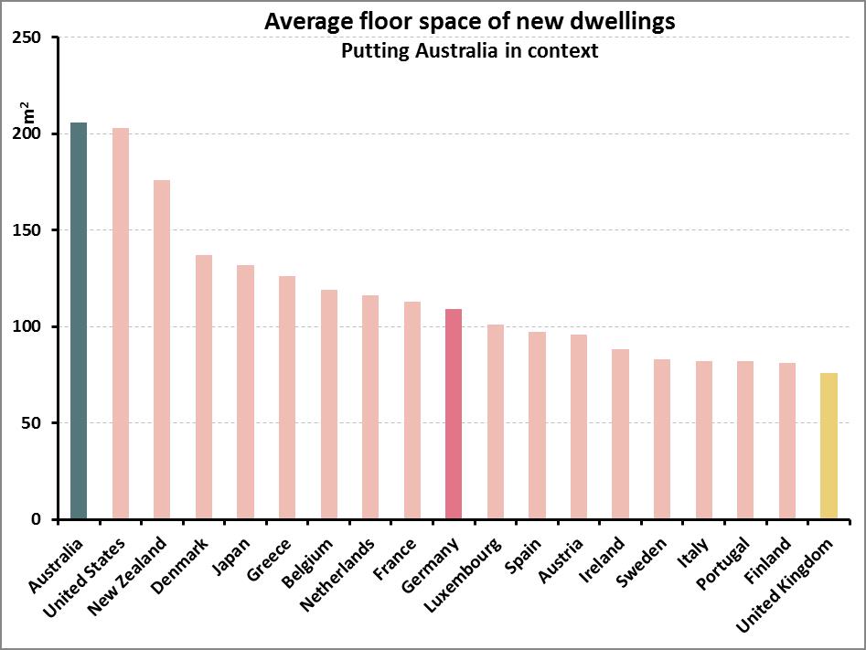
So, when we hear international house price comparisons, it’s worth remembering we’re not always comparing apples with apples, but rather their apples with our watermelons.

Does Australia have a housing affordability crisis? It’s hard to say. It depends on your definition of affordable. However, there is a lot of room to move if we want to decrease the cost of housing without lowering our standards beyond what is considered acceptable across the rest of the world’s richest countries.

After all, do we even want our in-laws to have a spare room at our place to crash in?  Save yourself the $300k, and shout them a five-star hotel for the few nights a year they do visit the grandkids.


[1] http://www.domain.com.au/news/melbourne-apartment-boom-is-it-working-for-buyers-and-residents-20160429-gogjvs/

[2] http://www.oecdbetterlifeindex.org/topics/housing/

[3] http://www.abs.gov.au/AUSSTATS/abs@.nsf/Previousproducts/8752.0Feature%20Article1Jun%202013

[4] http://www.demographia.com/db-intlhouse.htm

How Aus $ affects Aus votes

How Aus $ affects Aus votes

There is no correlation between an electorate’s socio-economic standing and its preferred political party, at least not in the 2013 elections.

The simplistic view of politics suggests one party proposes policies which help poor people and the other party angles to improve the lives of those more fortunate. Yet, in Australia, the socio-economic make-up of an electorate is a very poor predictor of which party will be voted in, at least not nation-wide. It seems Labor electorates are not the working class suburbs usually portrayed, and Liberal electorates aren’t the prime real estate so often generalised.

This is clearly seen when focusing on the top 10 Liberal/National coalition seats.

Top 10 Liberal Seats

As the graph above shows, the ‘rich’ are grossly under-represented in the top 3 ‘liberal/national’ seats, and in three more of the safest Liberal seats.  On the other hand, they are hugely overrepresented in the other 4 of the top 10 seats (averaging 85% of each overrepresented electorate).  As an example, Mallee, on the NSW/Victorian border, has the highest Liberal vote, yet over 50% of the population falls in the bottom 30%, and only 6% are considered in the top 30% of Australia.

The graph below examines the link across all the electorates, by mapping the Labor 2-party preferred vote to the percentage of the electorate which falls in the bottom 30% of the socio-economic spectrum. (It’s a mess!)

Link Labour SEIFA

Similarly, there appears to be no relationship between party allegiance and private schooling.  For all the apparent willingness of the Liberal party to support private schools, areas with a high percentage of kids attending private school are just as likely to vote blue as they are red.

Liberal Private schools

While it seems there is no link between ‘class’ and politics Australia wide, a relationship does exist within capital cities.  Filtering out electorates which have less than two-thirds of its population within a capital city (using ABS’s remoteness divisions), a correlation of 0.51 appears between the Labor vote and areas with high proportions of low socio-economic households.  This means that the larger the percentage of ‘lower class’ households in an electorate, the more likely Labor is to win the seat.  Similarly, the more rich households there are in a city electorate, the more likely the Liberal Party is to win.

(Graph slightly less messy.)

Link in Cities

No such link appears to occur outside of the major cities, neither in regional cities nor in rural areas.

So, are parties not catering to one side over the other, or are constituents unable to discern how each party’s policies will affect them, or do people not vote based on what may benefit them? Or is politics a whole lot more complicated than that?


______________________________


Sources

Voting from Australian Electorate Commission http://results.aec.gov.au/17496/Website/HouseDownloadsMenu-17496-csv.htm

Socio-economic and School attendance from ABS, Census Statistics.

http://www.abs.gov.au/websitedbs/censushome.nsf/home/Census?opendocument&ref=topBar

Smoking the poor

Smoking the poor

Australia’s 2016-17 budget announcement included “four annual 12.5 per cent increases in tobacco excise and excise equivalent customs duties”, claiming it will raise “$4.7bn over the next four years”.¹

This is unlikely to face much opposition. After all, taxing smoking aims to discourage the leading cause of preventable deaths in Australia².

But it’s interesting to see who will be most impacted by this, as smoking is a poor person’s game.

Based on 2009-10 household expenditure data³, increasing the cost of smoking will have a much larger impact on the poorest sectors of the community than anyone else.  More specifically, it will impact households receiving unemployment, disability, and carers payments – those already under the most amount of financial strain.

Smoking poor

Back in 2010, the poorest 20% of households were already spending four times as much of their weekly expenditure as the richest 20%.  Households whose main source of income was unemployment benefits spent three and half times the national average on tobacco, in relation to their total income.  Those whose main income was disability and carer payments spent three times the national average.

This is likely to be much more accentuated today as the 25% annual increase in tobacco excise since 2010 has almost doubled the price of cigarettes since that data was produced[4].

So how will this picture look in 4 years’ time, after 8 years of tobacco increases, when a packet of winnie blues cost $50?

Smoking is addictive. I suspect it’s easier to sell a house than quit smoking. Yet, when governments change legislation, making previous decisions less financially desirable, there’s usually talk of ‘grandfathering’ policies. That is to say that if we ever change capital gains policies we’ll ensure those who got in on the action prior to the changes don’t lose out.  Should similar considerations be made with smokers? Or is this more like the drug dealer who gives away the first few hits until you’re hooked, and then jacks up the prices, marginalising the destitute to a life of crime, imprisonment and social isolation?

I suspect it’s not all bad. Many will quit, thus improving their lives, and those of their loved ones. But for those unable to let go of nicotine’s vice, I suspect health issues will be only part of their worries.


[1] http://www.budget.gov.au/2016-17/content/glossies/tax_super/html/tax_super-05.htm#health

[2] http://www.quit.org.au/resource-centre/facts-evidence/the-big-kill

[3] http://www.abs.gov.au/AUSSTATS/abs@.nsf/Lookup/6530.0Main+Features12009-10?OpenDocument

[4] http://www.tobaccoinaustralia.org.au/13-3-the-price-of-tobacco-products-in-australia

Funding a safety net for private education

Funding a safety net for private education

Private education allows parents to segregate their offspring based on various socio-economic boundaries.  It limits kids’ socialisation across the wider community, and diminishes awareness of how others live. I don’t believe private schools help create a better society, and it should cease to be a legitimate option.

However, while parents are allowed to send their kids to private schools, it is the government’s responsibility to ensure these are adequately funded to provide a standard level of education.

I usually sit on the anti-paternalistic side of the fence, but I also don’t believe children should suffer due to their parents’ bad decisions. So, much like enforcing vaccination, I think the Government should support private schools to provide decent education.

It may surprise many to know that Australian private schools have less money per student than Government schools ($15,500¹ vs $16,177 in 2012-13²).

While funding for Government schools is relatively evenly spread³, private school funding ranges widely depending on the school and its community.
When picturing private schools, many imagine the top echelons of elitism.  Pompously dressed kids hopscotching their way to Scotch College, Xavier or Sydney/Geelong/Brisbane Grammar.  These do possess much higher budgets than public schools, and should potentially lose all subsidies.  But for every Scotch kid sipping their single-origin soy-latte for morning-tea there are numerous Penola Catholic College and St Bishoy Coptic Orthodox College students boiling their International Roast.  These less famous private schools make up the majority of the private student population.

In 2012-134, the average private contribution to non-government schools was $6,574 per student.  Unfortunately, the MySchool website does not facilitate broad research as not all information is easily available in one dataset5 (figures have to be searched one school at a time), so studies on this is difficult.  However, by cherry picking some obvious cases, private contributions (fees, charges, parental contributions and other private sources)  range from $1.5k to $37.3k (Our Lady of the Sacred Heart Thamarrurr Catholic College NT and Sydney Grammar School being the examples). Seeing as the average is just under $7k, there must be way more schools like Thamarrurr’s than Grammar schools (in funding terms). Without government funding, the majority of private schools would have less than half the $ per student that state schools have.

School funding by decile

While the likelihood of attending a private school increases with socio-economic standing, 22% of students from the lowest socio-economic decile attended a private school based on 2011 Census data.  And over a third of “middle class” students (deciles 4 to 7) attended these schools too6.

While attending private schooling is a choice, it’s usually (I assume, don’t have the figures here) a choice made by the parents, not the kids. Kids whose parents make bad decisions probably already suffer enough through other means. At least their schools should be adequately funded.

Private school fees can be exorbitant, but most people aren’t aware of the amounts spent on public education, so the fees we hear about are hard to contextualise or compare.

In 2013-14 Australian Governments provided $16,177 per student to public schools.  This funding was also topped up by parental contributions and other private sources. While fees and extra funding in public schools may not be as much as private school fees on average, they can amount to considerable figures.  One example found by searching in wealthy areas is that of Auburn State High School, in the Western Suburbs of Melbourne7, which accumulated over $4,000 per student from private sources.

{As an aside, the examples above show how public schools in wealthy areas (e.g. Auburn) have greater private funding (on top of greater government funding) than some private schools (e.g. Thamarrurr in the NT).} 

By sending their kids to private schools, parents default on ‘full government assistance’. Government contributions to private schools bring the average funding up to almost public school levels.  The current federal government funding model for private schools takes into account the socio-economic situation of the students’ families. Schools with high socio-economic students receive as little as 30% of a “full government funded student”, and schools with low socio-economic student receive as much as 70%.  It could be argued that the current funding model is not targeted enough.  Rich schools should receive 0%, and poor ones closer to 100%.

Having said all that, this is trying to deal with a sub-optimal situation.  Better still would be to remove the possibility of kids attending such establishments, and ensuring all students get the education they need, without segregation by religion, social standing, or any other way in which you want to cut society.


[1] Derived from https://www.aisnsw.edu.au/Publications/Other/Documents/ISCA%20Snapshot%202015.pdf & http://www.ncec.catholic.edu.au/resources/publications/353-2013-annual-report/file

[2] Latest comparisons freely available.

[3] Funding for schools differs according to the needs of the students attending, but the range is a lot smaller than private school funding.

[4] Latest freely available.

[5] Despite Federal Government having a policy of “open data by default”.

[6] This analysis uses the SEIFA Index of Relative Socio-economic Advantage and Disadvantage (IRSAD).

[6] This might be the topic for another post.